Remember me? I’m the guy who used to post on this blog. Seems like it’s been a long time since I have, but I have an excuse – kinda. I’ve been sketching up a storm and I’ve had nothing to report.
I know that makes no sense but I don’t make sense on a regular basis so what’s new? Here’s the deal. I’ve been taking art classes. First I took Liz Steel’s Foundations class. This is a wonderful class taught, as twelve well-organized lessons. I thoroughly enjoyed it and in spite of having been exposed to the ideas because of my voracious reading propensity, I learned a lot and did a LOT of sketching for this course. If I had any idea whether Liz is going to teach this course again I’d tell you where to sign up. I don’t so you’ll have to ask her.
Then I signed up for Marc Taro Holmes’s People in Motion class, which is offered by Craftsy for a pittance. Marc is not only a superb artist but an amazing instructor. I’ve burned through a lot of paper following Marc’s attempt to teach me to draw people in a “painterly” fashion. Still much work to be done on that front I’m afraid.
So why don’t I have a lot of sketches to post from those courses? Because when I took my first online course I came to the conclusion that, for me, posting results of my efforts in a class really stifled my openness to the new ideas and approaches. I would become concerned about complete, postable sketches rather than doing the real work of struggling to do whatever was being taught in the course, relying more on what I knew than what I was trying to learn. And so a “policy” was born and you’ll never, well almost never, see anything I do in association with a course. I believe I’ve made an exception twice.
What do I gain from this goofy way of viewing courses? Freedom. Freedom to spend time copying the instructor’s work, trying to get into their heads. Trying to feel their way of visual thinking. Getting as far away from my own way of doing things as possible. Not worrying about “complete” anything if it serves the purposes of learning. I’ve spent pages just making marks with a Pentel brush pen in an attempt (failed thus far) to achieve the marks that Marc makes consistently. I’ve done dozens of thumbnail sketches of my office and its contents in an attempt to understand how Liz dissects an area she’s looking at and I’ve copied her pages of thumbnails to see if I could get a sense of her visual thinking as she looked at the scene she showed us in the video.
But if you’ve read this far, let me abuse you some more (grin). One of the things Marc emphasizes is drawing regularly and he suggests the Moleskine Cahier as a “scribbler” notebook so you can do quick sketches everywhere you go. I’ve followed this practice for almost two years and in my view, this is the way to learn to draw quickly and no amount of drawing from photos teaches what a ‘scribbler’ will.
 I’ve never thought much of Moleskines but decided to give the Cahier a try in a whirlwind quick-sketching binge. I filled one of these notebooks in three days. I admit that I had to skip the backs of some pages as it was impossible to draw on them because of severe ghosting and bleed-through but more on that later. I approached this with the idea of trying different techniques and pointy devices so I’ll show you’ll see that reflected in the sketches.
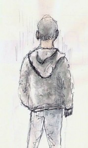
Here are a couple sketches done in my typical style. I suppose they do reflect Marc’s course a bit as I tried using a Pentel brush pen to add emphasis to some of the lines but mostly they reflect my limited style of doing 1-2 minute sketches of people on location.
 I’ve included this one to show you the problem I ran into with ghosting and bleed-through. This one is only moderately bad. Many back pages were so bad that the it was impossible to even think about drawing over it.
I  decided to do a very dark sketch. This guy was actually holding a cell phone but somehow he ended up with a book in his hand. Not sure what my brain was doing to cause that to happen.
 This guy caught my eye. His thin face and odd hair reminded me of someone in a movie but I can’t tell you who. In addition to making his eyes too big, I decided to add watercolor and learned that the Moleskine paper generates little spots in any wash you lay down. What’s up with that?
Here’s another one that shows some of the ghosting in this notebook. Very distracting while drawing but this was ‘practice’ so it shouldn’t matter, right? It mattered…to me.
The next day I went to a coffee shop and started a repeat performance. I had learned that I really needed to work on the brush pen as I have no control over it whatever.
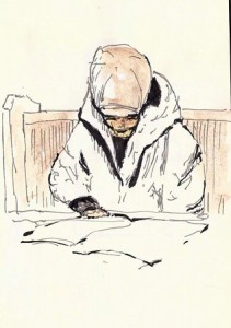 This first sketch (actually the third as the first two were destroyed by bleed-through), suggests that I was a bit timid as I didn’t do much with the brush pen. Frankly, I think it’s one of the best so maybe that is an indication that I need to use brush pen less. I kept the watercolor very light as I was trying to conserve the backs of the pages. Didn’t help much.
 For this guy, I got carried away with the brush pen in an attempt to learn how to control it. There was also a certain amount of “if the little mark looks horrible, making it bigger will somehow make it better” going on here.
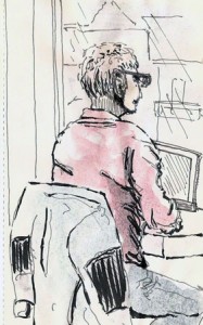
As I finished up my café allongé the guy below set up his laptop and sat down to look out the window and scroll through his Twitter feed. I was getting tired and so decided this would be my last sketch of the day and I ended up spending a couple extra minutes faking in some of the ‘across the street’ features of the scene.
The next day, 30 or so sketches into this marathon, I went to a food court. I decided to use a ballpoint (Parker Jotter) for these sketches. This does solve the ghosting and bleed-through as long as you avoid watercolors. But what fun is that? Anyways, I drew a bunch of people ordering food until I ran out of pages.
So, what did I learn? Well, you can draw nearly 40 quick-sketches in three sessions if you want to and limit each to a couple minutes each. I learned that I REALLY don’t like Moleskine Cahiers. The notebooks I’ve been using cost me $1-2 from the dollar store, have twice the pages and half the ghosting/bleedthrough problems.
But I do really like the ‘cahier’ notebook format. Field Notes and Baron Fig’s Apprentice series all come in blank paper format or even dot-grid which I find acceptable. The very thin nature of these notebooks works against them in terms of paper thickness, though. They typically have 12-sheet signatures which is too many if want 140lb watercolor paper. But there’s a middle ground and improved paper quality, even if it’s only a 60lb paper, would go a long way towards mitigating the problems. I’m looking for such a solution so if you know of any 30-40 page, thin notebook that tolerates fountain pens without the back of its pages being obliterated, let me know.


