Field Notes Workman’s Companion Edition

I do a lot of sketching in tiny, inexpensive sketchbooks and ever since Marc Taro Holmes suggested using a Moleskine staple-bound notebook, I’ve been trying different notebooks in this 3×5 format.  I was very displeased by the Moleskines as ink bleeds through their thin paper.  So far, every book I’ve tried has that problem.  I’m not talking about ghosting, where you can see the sketch on the backside but ink that actually shows up on the back of the page.  While ghosting is also a problem in most of the notebooks, I’m more tolerant of that as my goal with these books isn’t high-quality sketches.

But FINALLY, I’ve found what I’ve been looking for and it comes in the form of the new Field Notes Workshop Companion issue.  Field Notes are fun because they’re sold in a variety of cover formats.  The problem with them is that they typically use 50lb, inexpensive paper and they’re just not fountain pen friendly.  If you draw with ballpoint pens, they’re fine and very convenient.  But I’m a fountain pen addict and it’s a no go as a sketching substrate.

The Workshop Companion books are different.  They  come with a new, 70lb paper that’s a higher quality than even the couple issues they’ve produced with 70lb paper in the past.   I find I can force ghosting to the point of being annoying but it requires that I really dump a lot of ink on the page.  So far I’ve yet to get any bleedthrough, even with brush pens.  I’ve even applied bits of watercolor to the paper and even that works pretty well.

WC_FN

My first test was a simple outline image, done with a Platinum Carbon Pen and Platinum Carbon ink.  This was a ‘soft’ test as most of these kinds of notebooks will handle this combination, though in this case there was no ghosting whatever, which was an improvement.

2015-06-24FN01
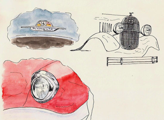
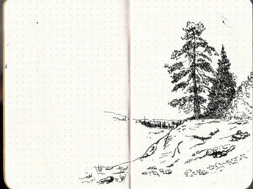
I went out sketching and did these quick sketches.  My goal was to try adding some dark shading to see what happens.  This is where most books in this format fail, with both bleedthrough and ghosting.  Here there still wasn’t any bleedthrough and you had to look hard to see ghosting.  Scanning didn’t pick up any of the ghosting.

2015-06-24FN02
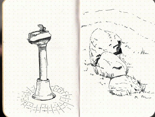
No special tests here but I was drawing with my Namiki Falcon and De Atramentis Document Black and again, there was no bleedthrough and ghosting was hard to see.

2015-06-24FN03
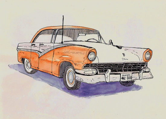
I was doodling while watching a baseball game and dragged this image up from my imagination.  It’s got enough darks in it to really test for bleedthrough and ghosting.  Ghosting can be seen but again, it’s minimal.

2015-06-24FN04

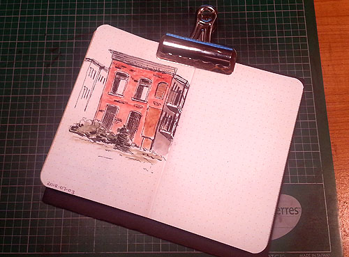
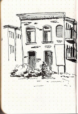
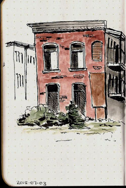
I thought I’d do the acid test.  I was watching some guys playing soccer and started drawing this building that was at one end of the soccer pitch.  I added some darks with a Kuretake #33 brush pen and then added some color.  Still no bleed through.  Ghosting is a bit worse but everything’s relative as the ghosting doesn’t get picked up when scanning the backside of this sketch.

2015-06-24FN052015-06-24FN05C


In conclusion, I’m a happy camper and I’ll be ordered some more of these Workshop Companion books.  They’re wonderful.  I can shove them in a shirt pocket if I want but more often I have it in a front pouch in my sketching bag so it’s immediately available.

While I can sketch in these books fine, when sketching a 2-page spread it’s nice to have something to hold the book open and flat without having to fiddle around.  I solved that by cutting a small piece of Fomecore, which weighs nothing and I clip the book to this backing board.  It works surprisingly well and really makes holding the book a lot easier.

BackerComp


This is what it looks like when clipped to the board.  It becomes a single unit where you don’t have to worry about keeping the paper flat.

BackerWFN


Sketching At The Stewart Gallery

What do you get when you combine a fantastic urban sketcher group with a great city cultural center, who happens to exist in a beautiful mansion and grounds along the shore of Lake Louise?  The stuff that dreams are made of, at least for this sketcher.

I was determined to get to Montreal for at least one of the USK-Montreal group’s sketchcrawls this year and it was only by “guess and by golly,” as my dad used to say, that I chose the one scheduled for July 5th.  It was to be held on the grounds of Stewart Gallery on the opening of a exhibition of art by Jane Hannah, Shari Blaukopf, and Marc Taro Holmes.

Sunday morning I headed off with my buddy Yvan.  There’s nothing better than traveling with another sketcher as time flies as art discussions, discussions of the cool house with the red roof that we just passed, how the distant barns and tree line would make a nice sketch, and all the rest of the stuff that sketchers talk about took place.  In no time we were there…and my jaw dropped.

The Stewart Galleries is an amazing place but what was more amazing were all the sketchers dotting the landscape.  There were dozens of them.  No, there were more.  One count suggested there were 80 of them…all in one place, all of them sketching, chatting and having a great time.

My eyes were in information overload.  This was a wonderful place to sketch but whose got time to sketch when there are so many sketchers to meet, so much art to see.  All I could do was walk around talking to people.  I finally got to meet Shari Blaukopf and Jane Hannah.  Both are as wonderful as I supposed them to be from internet interactions.  I found Jane by walking up to every red-headed woman, asking if they knew Jane Hannah.  It was the one time I wished there were fewer people there, but I finally found her and met all the red-heads.  That’s gotta be good, isn’t it?

The Stewart Gallery was amazing.  The event coordinator, Amanda Johnston did an incredible job, as did her staff.  I’ve never been treated so well as a sketcher.  They provided coffee, snacks and free ice cream.  If you wanted, they even had pencils, paper, and clip boards available for those who came without their sketchbooks.  What was particularly great was that these offerings were used quite a lot by those attracted to the event by the USK-Montreal group.

Finally, guilt got the better of me and I decided that I really needed to draw something so I sat down at the edge of the lake and drew this view, looking away from Stewart Gallery towards the Pointe Claire marina.  It’s not my best work as it was rushed and my head was spinning with excitement.  Nevertheless, it is evidence that I sketched at the event.  Then it was back to talking, viewing the new gallery exhibit and enjoying the day.  Thanks to all who made the day so fantastic.

Stillman & Birn Beta (9x12), Namiki Falcon, DeAtramentis Document Black

Stillman & Birn Beta (9×12), Namiki Falcon, DeAtramentis Document Black

The View From The Car

BoulangeRdI rarely sketch from a vehicle as others do.  Truth is, I rarely have a vehicle available to me.  But a few days ago, with rain stifling my ability to walk and sketch outdoors, I went to Ile d’Orleans with my daughter.  We parked in front of the Boulange and after consuming one of their great pastries we got in the car and started to sketch.

The cadence of our activity was interesting.  Scribble, scribble, turn-the-windshield-wiper-on/off, scribble, scribble.  We had a great time, though I suspect most would think us nuts.  This is what I drew.

Stillman & Birn Beta (6x9), Namiki Falcon, De Atramentis Document Black

Stillman & Birn Beta (6×9), Namiki Falcon, De Atramentis Document Black

I was asked several times this weekend what watercolors I use and I have to admit that I rarely mention them on this blog.  I’m more of a line guy than a color guy and so it never crosses my mind to mention it.  But, it is the case that I use Daniel Smith watercolors almost exclusively.  I switched from Winsor & Newton about six months ago.

Outdoor Car Show Sketching

Last weekend I went to a large, outdoor car show in the park at Montmorency Falls, just east of Quebec City.  This is a show of hundreds of cars with thousands of people paying their eight bucks to look at them.

I mention this because people who haven’t done much location sketching often express how they’d be afraid to sketch in public.  I always respond with “people interaction is one of the best things about location sketching because only nice people ever talk to you and the interactions are always fun.”

I have to revise that view just a little bit.   Am I a bad person for getting annoyed at LOTS of people being really nice?  I started sketching and because there were so many people telling me how talented I was, asking if I was an artist, and telling me that they couldn’t draw, that I had a hard time actually getting any sketching accomplished.  Still, it was a great day and the people were wonderful.

I’m old, so ‘cool car’ means cars that existed when I was a kid.  In 1956 I was eight years old and Ford Fairlanes were everywhere.  And so, with every car imaginable on display, it was nature for me to find a ’56 Fairlane to draw.  I sort of messed up the wheels but otherwise I was happy with this result.

Stillman & Birn Gamma, Namiki Falcon, De Atramentis Document Black

Stillman & Birn Gamma, Namiki Falcon, De Atramentis Document Black

After attracting more than my share of observers while doing that long sketch, I decided a better tactic might be to wander around, drawing pieces of cars.  That was fun too and I did this page.  I didn’t complete the ’30s Ford front end as, well, I was getting really hungry and I would have had to stand in line for an hour to get something to eat.  I didn’t have the patience for that so I decided to go home.

Stillman & Birn Gamma (10x7), Namiki Falcon, De Atramentis Document Black

Stillman & Birn Gamma (10×7), Namiki Falcon, De Atramentis Document Black

Tina Koyama Limited Edition Sketchbook

TinaBookI’m a lucky guy.  Tina Koyama sent me one of her small sketchbooks.  She makes these from light watercolor paper and endows them with creative covers.  Now that I’ve used one, I know why all photos of her exhibit a big smile.

I’ve only done half a dozen sketches in this 4×6 book but it’s really fun to use and the paper holds up nicely to my pointy devices.   It’s a single 5-sheet signature, providing 20, 4×6 sketch surfaces in a very small, light footprint.

2015-06-24artMy first use was to quickly sketch this odd metal sculpture.  I’m not sure what it’s supposed to represent but I guess it represents it.  No matter, it gave me a chance to scribble in the book and slop on a bit of watercolor.

And then it rained.  It’s still acting like spring here and I was cloistered behind windows, limiting both my spirits and sketching subjects.

2015-06-25diggerAcross the street was this digger, so I drew it.  I should have turned the book and drawn across the long dimension but I didn’t so this image is pretty small.  Still, it was fun to let the Namiki Falcon wander around for a while.

This last sketch was done while I was out for a long walk.  For some reason I was in the mood for a large scene when I walked through the park at Pointe de Lievre, so I plunked my butt on a picnic bench and quickly sketched this and used a waterbrush filled with dilute ink to shade it a bit.  I deemed it a good use of 15 minutes.

2015-06-26PointdeLievreI’m really enjoying Tina’s tiny sketchbook.  I’m not sure she has convinced me to spend a lot of time making my own as I’d need to make a lot of them given the way I use small sketchbooks, but she’s nudged me a bit closer to the edge.