Never Ask A Sketcher What Is It?

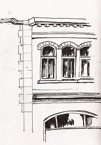
Anyone who is a parent has faced the uncertainty of responding to a young child’s beaming face as she looks up, waving a paper in the air and says, “Mommy, look what I made.”  The parent looks at the blob of color on the paper.  They note a roundish form, drawn in gray, four projections and some scribbles on top where a head might be.  Is it an elephant?  A cat?  Or is it me?  Only parents can properly negotiate that mine field.

And so it goes with sketchers, but with less delicacy I’m afraid.  When I brought my latest sketch home my Quebecois wife said, as she always does, “C’est beau,” but this time with puzzlement on her face.  Then, something she would never do when our daughter was growing up she blurted, “What the heck is it?”

My daughter came into the room, looked at the sketch and said, without any fanfare, “What is that thing?”  Obviously she has learned nothing from the finesse with which we greeted vague forms made from little hands with the best that Crayola had to offer.

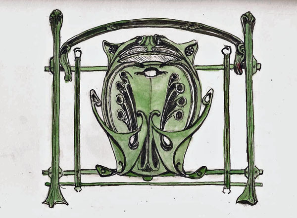
In this case, however, maybe I can forgive them.  It’s not something you see every day – or ever for that matter.  We don’t make stuff this elegant anymore.  But back at the turn of the 19th Century, those promoting the idea of subways felt the need to make them look spectacular because, for most people, the thought of going underground was, well, creepy.  This cast iron beauty is an entry gate from the 1900 Paris subway.

The sketch was done at the Musée de la Civilisation museum, in the Paris exhibit.  Eighty-six of these gates were made.  I’d hate to have to draw all of them.  One was enough to generate smoke from my ears.

Stillman & Birn Zeta (6x9), Pilot Prera, Noodler's Lexington Gray

Stillman & Birn Zeta (6×9), Pilot Prera, Noodler’s Lexington Gray

The Power of the Hero “bent-nib” Pen

Some sketchers love watercolors.  Others are passionate about line.  And, of course, there are those who do a combination of the two, with varying emphasis on one or the other.

For myself, if I had to do one or the other, line work, particularly that made by fountain pen, would be my choice.  My use of watercolor is similar to what I did with crayons when I was a kid – I “color” inside the lines.

My lines tend to be thin and my favorite pens are those that produce them.  Pens like the Pilot 78G, Pilot Prera, and Platinum Carbon pen are among my favorites.  My TWSBI Mini produces a slightly heavier line but even it is finer than the typical “medium nib” pen.

One intriguing exception in my personal fountain pen mountain (and I swear that I need them all) are my Hero “calligraphy” pens.  Some call them “bent nib” pens.  The “calligraphy” moniker is misleading for western-worlders as they don’t work at all like western calligraphy pens but are, rather, designed for writing Chinese characters.  You affect line width by varying the pen angle rather than pen direction as with a western calligraphy pen.

There are several companies that produce them but Hero is the company that seems to make the largest number of models.  They are available in North America for not much money via eBay but one must be careful to ensure you’re getting a calligraphy pen as Hero makes standard fountain pens as well.

Hero 578 fountain pen.  Note bent tip.

Hero 578 fountain pen. Note bent tip.

I have several of them and I’ve played with them some but have never taken them seriously.  I’ve decided to change that and really learn to use them.  To me, their big advantage is the ability to generate very wide lines as well as fine ones, permitting the creation of larger dark areas in a pen sketch.  Their downside is that I can’t get as fine a line as I can from some of the other pens I’ve mentioned.

I was out the other day and I did this quick sketch from the 2nd floor dining area of our downtown McDonalds.  You can see how even an inexperienced person like myself can generate high contrast sketches using the pen.  Here I’m using a Hero 578, which is a fairly heavy pen but I like how it feels in my hand.

Stillman & BIrn Alpha (4x6), Hero 578, Platinum Carbon Black

Stillman & BIrn Alpha (4×6), Hero 578, Platinum Carbon Black

Later, while at the Musée d’Amerique Français I sat in a comfy chair, looked out the window and sketched this portion of one of the seminary buildings.

The folks who have the most experience with these pens are the Singapore urban sketchers.  Maybe with some practice I can begin to emulate them.

Stillman & Birn Alpha (4x6), Hero 578, Platinum Carbon Black

Stillman & Birn Alpha (4×6), Hero 578, Platinum Carbon Black


The Missing Sketching Equipment

Most books on sketching will start by telling you how much fun sketching is and how little equipment is required to do it.  A pencil and a piece of paper is sufficient, they say.  And it’s true…sort of.  But it’s a lot more fun if you buy one of each kind of pencil, pen and paint and try every flat drawing surface on the market today…or so it seems if I look around my office.

If you’re a street sketcher, however, there are other things you need.  The most basic thing, of course, is something in which to carry your one of everything, or some subset thereof.  AND, if you’re like me and aren’t comfortable sketching while standing, you need a stool.

StoolOpen_smI carry a Walk Stool myself.  I’ve owned it for a couple years and use it several times a week.  In spite of this heavy use it still looks like new.  It’s light; it’s comfortable; and it folds up small.  But it only works if you take it with you and that was my problem last Tuesday when I went to the Musée de la Civilisation to sketch.  I’d forgotten to put it in my bag.

There were lots of things to sketch.  There were lots of places to sit.  The problem was that they weren’t in the same place.  I wandered, and wandered, looking for a place that would provide both subject and seat.  About the third circuit of the museum I my criterion for a suitable place reached a sufficiently low point that I realized that I could sit in the hallway and look through windows at the back of some of the exhibits in the Native American exhibition.  The back of this dancer is the result.

Stillman & Birn Zeta (6x9), TWSBI Mini, Platinum Carbon Black

Stillman & Birn Zeta (6×9), TWSBI Mini, Platinum Carbon Black

Sketching in Pencil

I met Claudette this morning for a sketching session at the Musée d’Amerique Francophonie.   I want to say this is a tiny museum but it’s actually a fairly big building/facility.  They just don’t have much in it 🙂  But there were a couple pieces that Claudette wanted to sketch so that’s where we went this morning.

I wandered around, looking for something to sketch.  We’ve done group sketching events there on several occasions so I was very familiar with the displays.  So, after wandering a bit, I finally settled on a statue (former mayor I think) as my subject.  Since we’ve been discussing pencil drawing in one of the Facebook groups, and since I know nothing of pencil drawing except that I tend to smear everything I draw, I decided to do this sketch with an HB mechanical pencil.  Definitely a KISS principle drawing.  It’s also a sketch that demonstrates why I use my fountain pens (grin).  It was done on a light gray Canson Mi-Teintes (6×9).

2014-01-30MuseeAmerique_72

Sketching The Art of Fernand Pelez

I rarely sketch from art unless I’m trying to learn how DaVinci did it, or how my buddy Yvan Breton does his people sketches.  But the Paris exhibit at our Musée de la Civilisation has a couple of large that just say “sketch me.”  I think it’s because of their size and content.  One is a 21-foot long mural of the Parisian open-air market in 1900.  The other is an equally large circus mural titled Grimaces et misére by Fernand Pelez (1888).

Grimaces et misére depicts circus performers, including dancers, musicians, clowns and others, but unlike most circus art, these figures are depicted in what was probably a more realistic state.  The faces and body language of these characters are sad, tired, and suggestive of their overworked, day-by-day lives.

I, along with my buddy Yvan decided to meet Tuesday morning to sketch the musicians who represent about 25% of the mural.  He drew in pencil; I used my Wahl-Eversharp pen and Noodler’s Lexington Gray.

The paper was Canson Ingres (6×9).  I like the lightly toned versions of this paper for pen drawings, though it would be quite useless for watercolor.  The bit of added tone came from dilute Lex Gray in a waterbrush, while the white was done with a Stabilo “paper-glass-plastic-metal” pencil.  I think Prismacolor pencil does a better job but it was worth a try (grin)

2014-01-28OrchestreFrancais_72For those asking “What the heck is that instrument on the right,” I was equally curious and so I did some digging.  Turns out it is an ophicleide, a precursor to the tuba.  It’s actually a U-shaped tube but the downward part of the tube is behind the upward portion so you don’t see it in the painting.  But you can see the mouthpiece which is very tuba-like.