Halloween – Urban Sketching Style

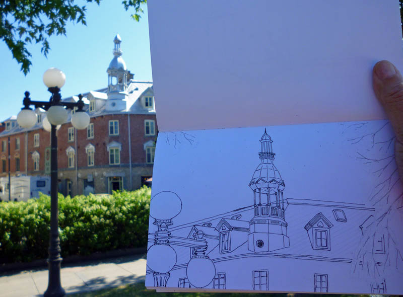
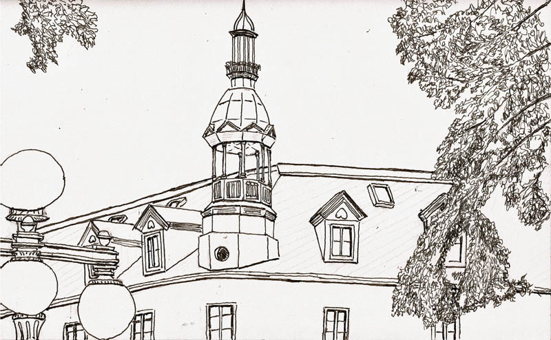
This is the time of year that sketchers post beautiful sketches of pumpkins.  I love them all.  I figure this to be my first Halloween as a sketcher.  Last October I’d just started try to move pointy objects across paper and I wasn’t up to the task of sketching pumpkins.  So, a year later, here’s my first set, done with a black ballpoint pen that blobbed on me more than a few times, adding “character” to my sketch.

Stillman & Birn Beta sketchbook (6×8), Pentel RSVP ballpoint, W&N watercolors

But I’m an urban sketcher.  I sketch buildings, lamposts and fire hydrants.  I guess a group of pumpkins sitting on my kitchen table is ‘urban’ but you have to mentally squint to see it.  So I thought I should do something else and I found the ideal subject as I walked the main street that runs through our port area.   What could be better than an orange building with some black Halloween decorations on it.

Stillman & Birn Alpha sketchbook (10×7), Pilot Prera w/Noodler’s Lexington Gray, W&N watercolors

When I sat across the street to sketch it, though, I had an immediate problem.  There is considerable vehicle traffic on this street and when sitting low on my tripod stool, it was hard to see the lower front of the building.  I’m not good enough to sketch moving vehicles so I sat, looked and pondered.  Then I sat, looked and pondered some more.  What to do.

I got out a 3H pencil and started laying out where the building and stairwell would sit on the paper and marked out the door location.  Then I picked up my stool and walked down the street and found a place where I could sit the ‘right’ distance from a car.  I sketched it as though it was moving in front of my, as yet to be drawn, building.  Then I moved back to the building and sketched it.  I’m not sure I got car and building sized properly relative to one another but it’s close enough for me.  Hope you like it.  Happy Halloween.

Cheers — Larry

Brightest Building in Quebec

The leaves are falling from the trees and temperatures are heading in the same direction.  It won’t be long before I won’t be able to stalk the streets of Québec, looking for buildings to sketch.  I guess I’ll have to go inside and stalk Quebecers to sketch.

But I was out today and walking a street I’d walked many times.  Either I’m going blind or this small ‘casse-croute’ (in some places it would be called a chips stand) has just gotten a very bright facelift.  In any case today gave me opportunity to capture its essense, which I did.

Stillman & Birn Alpha sketchbook (10×7), Pilot Prera/Lexington Gray, Winsor & Newton watercolors

I did the basic sketch on site but decided to come home to do all the signage as I wanted to try out some different tools.  To that end, the large sign and the plates of food were done with colored pencils, a medium I have yet to conquer.  The ‘Frites maison’ sign was done with some Stabilo felt pens I just bought…and like very much for doing such things.   The building’s kinda cute, don’tcha think?

Cheers — Larry

larry@larrydmarshall.com

A Shivering Good Sketchcrawl in Quebec City

Today we had our second sketchcrawl in Quebec City. The best description of what went on may come from the fact that I learned a new French verb – “frissonner.” It means to shiver and that’s exactly what I was doing as I tried to sketch a restaurant at the QC marina. That sketch, in all its “frisonner” wavy lines may get finished up but it will occur in my office.

Bethann and I were the first to bail out, though others were already huddled against a wall that broke the wind. We went into the Marché de vieux port (our farmer’s market), got coffee and Bethann spotted some empty tables and chairs, left behind by summer kiosks, now closed for the winter.

We set up shop and couldn’t have asked for a better place to sketch and talk sketching. There was also eating involved. The rest of the group quickly gathered and we were entrenched for the day. Nobody wanted to go outside.

If this wasn’t luck enough for anyone, the kiosk next to our “meeting hall” was owned by a very nice woman who sold blueberry syrups and some incredible chocolate/blueberry pieces of heaven. AND she brought us a platter of the stuff.

Here’s my shivering sketch, a view from across the marina:

Stepping Through My Sketching Process

Patrick Ng presented one of his sketches by showing us all the stages of development in a series of posts in the Facebook group, Artist Journal Workshop.  I thought that was a great idea and so I’m going to do that here.  Click on the photo to get a larger image.

On Location PhotoFirst stage occurred on a hot day, in front of the Quebec City train station.  I decided to draw a building that sits at 363 Rue St. Paul, partly because it was a great subject and partly because there was a shady spot where I could sit.  I didn’t quite get the drawing done in that first session as it still lacked the foliage, though that had been penciled in early in the process so I’d know what parts of the building would be covered by leaves.

B&W sketch

Once I finished adding the foliage and touching up a few of the details it looked like this.  I did this at home.

I decided to add shading with early morning sun as I thought it would be better than the mid-day sun I had when I did the sketch.  So, I went back to the site, plunked myself on my Walkstool and went to work.

Toned sketchI now use a small chunk of 8B Derwent Graphitone pencil, stuck in a half-pan, for my basic shading.  This has some interesting virtues.  First, I can use it just like a cake of watercolor, using a brush to pick up pigment and mix up washes of any density I need.  Second, it’s much smaller and lighter than the dilute india ink solutions I was carrying for this purpose.  AND, the important thing is that once Graphitone been exposed to water and then dries, it won’t mix with watercolors I put over it.   The end result of this stage sometimes causes me to wonder whether I need color at all.  This may be because I’m not all that versed in or experienced with watercolor (grin).

I like color, though, so I broke out my W&N watercolors and applied a moderate amount of color to the sketch.

I used a Pilot Prera fountain pen with Noodler’s Lexington Gray ink to do this sketch.  In my opinion, the techniques are made possible, or at least easier, because of the fantastic, double-sized papers of the Stillman & Birn sketchbooks I use.  I can’t say enough good things about them.   If you find these sorts of posts useful, let me know and I’ll do more of them.

Cheers — Larry

larry@larrydmarshall.com

Inuit Urban Sketching

Here’s something you won’t see in many urban sketcher’s sketchbooks, an Inukshuk.  The Inuit have used these for years to provide directions, mark locations, and even to aid in caribou hunts.  Because of this, you can find these human-like rock piles scattered across the northern parts of Canada… or in souvenir shops, as miniature versions are quite popular.

This one, however, is in downtown Quebec City, on the Parliament grounds.  I’d guess its height at ten feet.  Yesterday wasn’t the optimal time to sketch it as there are barriers up around the grounds due to construction so I couldn’t get as close as I’d like, nor could I view it from its front, the optimal way to sketch an inukshuk (“in-ooo-shuck”).  But, I was there; it was there; and I sketched it as, these days, I’m interested in rocks and how to depict them.

This sketch was done in a Stillman & Birn Beta (6×8) sketchbook, using a Pilot Prera pen filled with Noodler’s Lexington Gray ink. Winsor & Newton artist watercolors provided the color.  I REALLY like the Beta sketchbook paper.  So thick, so friendly to both pen and watercolor.  I’ve become quite spoiled by my Alpha series sketchbooks but the Beta series is yet one step better for the kinds of sketching I do.

Any inukshuks in your town (grin)?