Quicker Sketching Search – Part Two

My last post presented an example of one of the experiments I did in my quest for a quicker sketching style.  Sometimes I think I’m just not seasoned enough as a sketcher to be searching for different styles but I also wonder whether such a search is the best way to become a seasoned sketcher.

Because it’s been raining, I’ve used the time to think about and try out some different styles and I thought I’d share a few of those experiments, which will surely amuse you.   Pratfalls are always popular.  Maybe you’ll get some ideas, even if they’re “I’d never do that” ideas.

This one was closest to my current style.  The differences are that I did it quicker, with no organization.  I think it suffers from too many restated, ill-defined lines.  S&B (9x6), Pilot Falcon

This one was closest to my current style. The differences are that I did it quicker, with no organization. I think it suffers from too many restated, ill-defined lines. S&B (9×6), Pilot Falcon

2015-04-22steeple
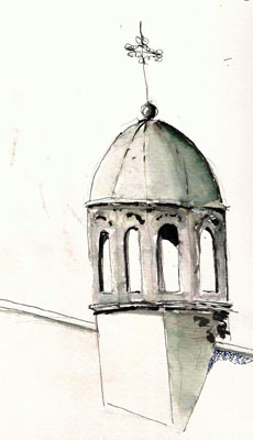
Sometimes I think about using a washable ink with watercolor on top.  Two things limit me with this approach.  First, I don’t have much understanding of watercolors.  More important, however, is that I don’t like the unpredictability of washable inks.  Call me crazy but I’m not one to enjoy the so-called “happy accidents”.  But here’s an attempt using Lamy black ink and some perylene green watercolor.  It was done quickly on a scrap of watercolor paper.

The results are reasonable but as I mentioned, I’m not a happy accident kind of guy so its fuzzy nature just doesn’t do it for me.

Pilot Metropolitan with Lamy black and a bit of Kuretake brush pen.

Pilot Metropolitan with Lamy black and a bit of Kuretake brush pen.

Marc Taro Holmes has blessed us with a recent series of blog posts on how to loosen up your approach and drawing hand.  This is one of a bunch of loose, almost scribbly sketches I’ve done as a result of those posts.  I was working on a large sheet of paper and doing a bunch of these smallish sketches and this one shows two of them, one drawn on top of the other.

I confess that this sort of thing is a struggle for me as when I start getting loose like this my brain tends to go to sleep and silly little things like angles and proportions start to go haywire.  If I can re-engage my brain while making marks like this, I think I could come to like it – a lot.

I went sketching one rainy day and ended up quick-sketching some people.  Here are a couple experiments.  Both were done in a 4×6 sketchbook.  The one on the left was done with a Platinum Carbon pen and PCB ink.  The ones on the right were done with a Kuretake brush pen.  I still struggle with control with this pen but it’s fun trying to sketch people with very few lines.

2015-04-23people


2015-04-25people

2015-04-26acroballOne evening I decided to do a sketch with a Pilot Acroball ballpoint pen.  I sometimes like ballpoint because I can get nice half-tones with them.  But for a hard-line, illustration sketch, I didn’t like it at all.  I couldn’t get good line consistency (lack of tooth in paper contributed) and so I think the result suffered.  Interesting experience but I doubt that I’ll repeat it.

2015-04-20streetlightI was waiting for a lunch date and decided to do a quick, loose interpretation of this light pole while I waited.  This was a lot of fun.  It felt similar to the loose line drawings I’d been doing but I did think about proportions before I started, marking where the various components were along the axis.  The result is far from perfect but a proper depiction of this piece of city paraphenalia and it didn’t rely upon any happy accidents.

I’ll continue doing my slower, detailed illustrations, but my quest for a style that would suit shorter time frames has only just begun.  It’s fun to try different approaches but thank goodness I’m not too wrapped up in the results.  What style(s) do you prefer in your own sketching and why?


Searching For A Quicker Sketching Style

I’ve only been learning to draw for three years.  I have a long way to go but my goal has always been to achieve the ability to sketch in styles similar to those of Pete Scully, Gerard Michel, and others who sketch buildings in a realistic fashion.  My own semi-cartoony attempts lack their skill with line and color but I’m happy with my results because I sketch more for the enjoyment I get from the process than the actual product.

The one downside of my sketching is that I’m slow…really slow, and that limits the situations where I can apply that meditative, let the brain head off into never-never-land approach.  I spend a lot of time quick-sketching (2-minutes or less) everything and anything to help me learn to see proportions and angles more quickly but the results are far too rushed to satisfy me.

I need an intermediate method – a method that allows me to capture a building or scene in less than 20 minutes, sometimes much less.  And so I’ve been playing around with a quicker, looser style.  I study how people like Marc Taro Holmes and Liz Steel create their magnificent sketches and while my skills are not solid enough to completely mimic their approaches, they are providing me both inspiration and some mental targets for achieving a more loose style.  I’m convinced that I’m only a few thousand sketches away from solving this problem.

Until then, here is a sketch I did while out walking.  It was too cold and windy to sit still for very long and so I quickly sketched this monument that sits in the park near my river.   I did it in a cheap, 5×7 sketchbook of unknown origin.  It’s one that normally sits on my desk and I use it to scribble ideas.  I used my Sailor Profit calligraphy pen and De Atramentis Document Black ink.

2015-04-19ParcBrebeuf

Making Room For Carriage Wheels

Our weather is marginal for sketching outdoors but the long winter has me pressing the limits of my cold tolerance.  I’m also motivated by the knowledge that at this time of year, there are areas in the old city that are more conducive to sketching (ie – you can see what you want to sketch) than they are later in the year when the tourists are here.

So, I put on a couple layers and headed downtown, to an area near the port area called Place Royale.  The most important feature there is a gorgeous church but I was after smaller game.

I was going to draw the corner of a wall – a special corner of a wall.  Streets in Quebec City during the 18th Century were narrow.  Carriage wheels, on the other hand, were very large and protruded out from the carriage, making it difficult to negotiate a carriage around the corners.

The solution was to inset the corners of the buildings for the first eight feet of so, creating an odd-shaped corner with no explanation if you wander the streets in the 21st Century.  But now, when you come to Quebec, you’ll know why some of the corners look like this:

2015-04-14CarriageCutouts

Stillman & BIrn Beta (6×8), Sailor Profit calligraphy pen, DeAtramentis Document Black, Daniel Smith watercolors


Sketching The Musee De La Francophonie

I’m just giddy with excitement that I’m getting some days that are warm enough for me to get out sketching on the street.  It’s a good time too as tourists aren’t yet filling the old city streets so I’m able to sketch some things in that area that are normally difficult because of all the people.

One such place is the Musée de l’Amérique francophonie.  It’s part of a complex of structures that used to be a seminary and Université Laval.  The university moved, long ago,  from the downtown area but its Department of Architecture still resides in one of the buildings.  These buildings have a rich history and I’ve sketched several of them but never the Museum entrance because it faces the town square and is next to a huge cathedral that is a tourist attraction.

But tourists won’t show up until it’s a bit warmer so I sat and sketched this grand structure.  Nothing better than sitting in the sun, coat zipped up, and sketching.  Hmm…no, it’s better without needing the coat zipped up.

Stillman & Birn Gamma (10x7), Sailor Fude pen, De Atramentis Document Black

Stillman & Birn Gamma (10×7), Sailor Profit calligraphy  pen, De Atramentis Document Black


Field Notes As A Sketching Medium

2015-03-21Sharpie_bookI’ve written several blog posts talking about my experiments with various small (3×5) notebooks as a medium for quick-sketching.  I’ve tried the Moleskine Cahier, the Baron Fig Apprentice and most recently Field Notes.  I even made a small binder for Field Notes to provide some support backing while sketching.  I think I’m about to bring that quest to an end and thought I report on what I’ve seen and what I’ve concluded from the experiments.  I wonder if Ponce-de-Leon and Coronado felt the way I do when they figured out that the fountain of youth and the city of gold were myths.

If I were quick-sketching with pencil, or ballpoint, this approach would work quite well.  But for fountain pens and certainly light watercolor washes, the paper is simply too cheap and too thin to handle the task.  Anything but the finest fountain pens will bleed through, causing the back side of the paper to be unusable.  I’m actually ok with that, though this reduces these notebooks to 24 pages making one (me) wonder why I’m not simply using better paper even if it costs a couple cents more.  Watercolor washes fail on two counts.  The paper buckles and the watercolor soaks in immediately and none of the techniques one (me) wants to use are possible.  Here are a few examples:

2015-04-10FN03

Bronze head — Pilot Falcon – some bleedthrough when I attempted to darken some areas

2015-04-10FN01

Pilot Falcon — this produces some ghosting but no bleedthrough except where I darkened shadow in lower section

2015-04-10FN05

I love Tootsie-Pops. This was interesting as I used the Pilot Falcon but a Pentel brush pen for shading. No bleedthrough at all.

2015-04-10FN04

Large bronze leaf/boat statue in front of the market area. Pilot Falcon and some light watercolor. All watercolor work buckled the papers considerably, though they sort of flattened once dried

2015-04-10FN02


So, in the end I’ve learned a few things.  Mostly I’ve learned that what I said a long time ago remains true.  To get good results you have to use good paper, at least I do.  Another thing remains true.  There isn’t any in a thin, small format.  The closest I’ve gotten to that was a small sketchbook I made by cutting up several sheets from one of my Stillman & Birn sketchbooks but I’m trying hard not to go down the road of making sketchbooks.