Roman Pitcher: What A Few Construction Lines Can Do

I was at the museum yesterday and drew a Roman pitcher.  Wednesday mornings are when Liz Steel releases a new lesson of her Foundations Now drawing course.  If you’re not already taking it, sign up.  We an amazing instructor.

What do those two things have in common?  Today’s lesson was about measuring and sketch “setup” to use her terminology.  I call it scaffolding but any way you talk about it, the goal is to look at your subject/scene and determine the relative sizes and locations of the objects, making some lines to indicate those relationships.  People seem reluctant to think about doing anything before they start drawing the “things” in their drawing but a few minutes spent before you draw actual “stuff” can improve both your accuracy and speed, the later more than compensating for the short time spent in analysis.

Stillman & Birn Alpha (10x7), Namiki Falcon, De Atramentis Docu Black

Stillman & Birn Alpha (10×7), Namiki Falcon, De Atramentis Docu Black

Once I got comfortable on my stool I just looked at the subject, trying to get a sense of shapes and sizes.  What follows is typically done using a 2H pencils producing lines so faint they won’t scan properly.  So, I took some tracing paper and drew them with a red pencil so you can see them.  Often I don’t even worry about erasing these lines as most just disappear.   Here’s what I did to draw this pitcher and why:

1) I realized that the bulk of the pitcher could fit inside a square.  Since I was working in a 10×7 sketchbook, I drew a couple vertical lines about 4″ apart to set the boundary of my drawing on the 7″ dimension of the paper.  I completed a square with appropriate horizontal lines.  Not only did this determine size but it determined location of the vase on the paper and ensured that I would have enough room and white space to make me happy.

2) I drew a vertical line at the halfway point of the square.  Centerlines for objects are generally helpful but in this case it was doubly so because the main pitcher was symmetrical and thus, having a centerline becomes a big help in the symmetrical curvatures of the pitcher sides.

scaffolding prior to drawing

scaffolding prior to drawing

3) I used dimension A to measure how high the pitcher mouth protruded above the main pitcher body and found it to be equal to A.  A quick line to identify that limit was all that was necessary, though I could have easily determined the width of the top of the pitcher at this time.  I just didn’t think of it.

4) At this point I’d taken a couple measurements using the ‘hold the pen up’ approach and drawn five lines.  I’d spent enough time looking at the pitcher to know there were three dips in the top edge of the mouth, that the handle attached between the back two and that the handle was turned a bit towards me and the pitcher spout turned slightly away from me.  I’m sure I also noticed other, more subtle things but these were the pertinent things.  It’s important to note that this is important information for drawing this pitcher and it’s best to know about it BEFORE you start drawing it rather than after you make an error because you didn’t.

5) At this point I switched to pen, but there was still more analysis work to be done along the way.  I felt the first thing I needed to do was locate the handle as it crossed in front of the top of the main pitcher body as I needed to know where that line would be hidden.  I thought about picking up the pencil again as it would have been easier to drop a couple angled lines to indicate the hand.  But I persevered and looked at 1) what was the distance between the left-most part of the hand from an imaginary vertical running upward from the body square.  At the same time I looked at the angle of an imaginary line that would run from the top of the pitcher body and that left-most part of the handle.  I put a dot there and another dot across from it to indicate the handle width at that point.  I did a similar analysis to determine how high the handle went above the ‘top’ of the pitcher mouth.  I don’t remember doing it but I also decided where the handle attached to the side of the pitcher body.  Then I drew the outer edges of the handle.

6) I was off to the races at that point.  I decided how wide the ‘cylinder’ that protruded to become the mouth was and put marks on either side of the centerline to indicate where it would intersect the pitcher body.  Then I drew the entire outline of the pitcher body, stopping briefly to do a similar determination about the base widths.

7) When I draw something more complex, like the convolutions of the mouth top edge, I do a lot of dynamic comparisons.  If I were really concerned with absolute accuracy I’d draw pencil lines to indicate the shapes but sometimes I just use my experience to compare a couple angles or locations to determine start/stop points for the various curves.  If you’re less experienced it might be a good idea to draw a box around this portion of the pitcher and then remove everything that doesn’t look like a pitcher mouth from that ‘block of clay.’  This is often very powerful as this forces you to look at it as the three dimensional volume that it is.

8) The painted details were pretty straight forward so I just freehanded those directly.  This was made easier because my basic drawing was accurate so I could rely upon it to locate the details.

Too often I see people talking about going “direct to ink” as some sort of badge of honor.  My goal may be more accuracy than some others but even if you like to draw with a loose style, just a few simple lines can give you the confidence that you’re laying down your loose lines in the right places.   You’ll also never be caught saying “I ran out of room for his feet.”

Looking Out My Window

After I finished with the snowblower this morning I looked out on a sunny, but cold day.  I allowed sloth to overtake me and I decided not to walk to the museum as I normally would.  Sketching statues is ok but I confess they don’t call to me as many other subjects might.

I looked out the window and saw this scene and decided to do a quick rendition of it.  A few light pencil lines in my Stillman & Birn Alpha (10×7) sketchbook to define rooflines, building edge and a couple lines to indicate where the main tree trunks were done before I turned to my Namiki Falcon with De Atramentis Document ink.  According to my wife it looks better than the real thing.  I hope she’s right.  One thing is certain.  This is a good example of how trying to do something quickly and drawing all the bricks is a bad combination (grin).

Stillman & Birn Alpha (10x7), Namiki Falcon, De Atramentis Document Black

Stillman & Birn Alpha (10×7), Namiki Falcon, De Atramentis Document Black


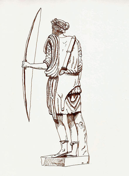
Artemis: Greek Goddess Of The Hunt

Long before Katniss Everdeen shot squirrels in the forest surrounding District 12, Artemis was the protectress of nature and the hunt for the Greeks.  With her spiffy garb and bow & arrow, she most certainly could have wowed them in any Greek version of the Hunger Games.

As a sketching subject she caught my attention, though the statue I drew from only had the stub of her bow gripped in her hand.  I used my artistic license to add her bow.  It just wasn’t right that she’d lost it.

Artemis: Goddess of Nature

Stillman & Birn Alpha (10×7), Pilot Prera, De Atramentis Document Brown

Sketching At The Canadian Aviation And Space Museum

20141201_AirMuseum_smWhen I was in science I used to visit the Canadian Aviation and Space Museum regularly.  It wasn’t because I was in science but rather because I’m an airplane fanatic airplanes and I worked at a research lab that was only a 90-minute drive to the museum.

I mention this because I’ve been sketching for three years and until Dec 01, 2014, I had never drawn a single airplane, in spite of my passion for them.  Why?  Cuz I can’t get excited about drawing from photos and there isn’t much airplane activity in Quebec City.

But now that my daughter is living in Ottawa, I have an excuse to go there so I finally got to sketch at this museum.  It’s a museum of significant size… airplanes are big and they have dozens of them under their roofs.  The main building (photo) is quite large and there’s an equal-sized building just to the right of the photo.  Both are packed to the gills with airplanes.  It’s a wonderful place, at least I think so.  Besides, if you’re old like me you can get in for $10 and they let you sketch to your hearts content.

I showed up shortly after opening time – at 10:30 and I quickly found a spot and started sketching.  I was in ‘detail’ mode that day, which meant I was concentrating hard on proper shape and proportion as, well, you know – airplanes are just supposed to be drawn “right”, don’tcha think?  You would if you were an airplane fanatic like I am.  Anyways, I used a pencil to draw the large shapes and then moved to my Pilot Falcon filled with DeAtramentis Black.  I was working in a Stillman & Birn Alpha (10×7) sketchbook – my favorite working surface.

Curtiss Seagull

Curtiss Seagull (in Stillman & Birn Alpha 10×7 sketchbook, Pilot Falcon, DeAtramentis Black ink)

I spent about one and a half hours getting the ink done and then took a break to have some coffee and relax.  While I was in the restaurant I added the color (Daniel Smith) to the sketch.  I was pretty pleased with the results but also a bit fatigued so I kicked back, enjoyed the coffee, which was no longer hot, and then spent a few minutes wandering around the museum.

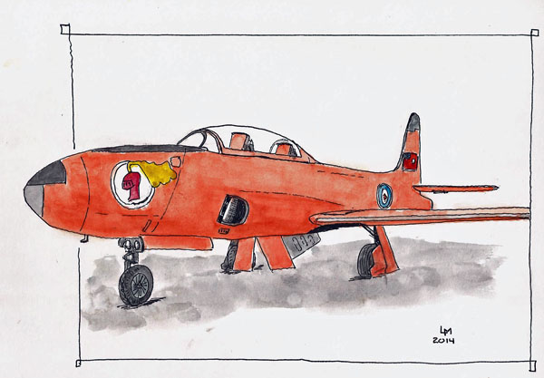
It was almost 12:30 by the time I decided to draw this T-33.  It’s always been a favorite and I could sit in an out of the way place and draw.  I needed to get on the road back to Quebec City by 1:30 so I quickly laid out some shapes and guidelines and went to work with my pen.  By 1:30 I had created this sketch and decided I’d better add color when I got home so I snapped a couple photos for reference.

T33 sketch with inspiration

T33 sketch with inspiration

I’m really bad about adding color to sketches and have a lot of them that ‘I’ll color it later’ never happened.  This was, almost, one of those sketches as I forgot all about it until I started to do this blog post.  Here’s the sketch with some color added.  I can’t wait to return to that museum.  Did I mention that I like airplanes (grin)?

T-33 (Stillman & Birn Alpha 10x7, Pilot Falcon, DeAtramentis Black ink)

T-33 (Stillman & Birn Alpha 10×7, Pilot Falcon, DeAtramentis Black ink)

It’s Museum Season In Quebec City

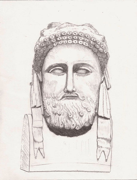
Only the brave would venture outdoors to sketch in Quebec City these days,  and I’m not one of them.   So, it’s museum time for me.  And because our Civilisation Museum is featuring a large exhibition of some remarkable white, plaster statues and busts from the Greeks and Romans, I’ve decided to set aside my fountain pens and try to learn how to push a pencil.  Strange gizmos these are as they produce a substance that is magnetically attracted to the little finger of my drawing hand, allowing automagic smudging of everything I draw.

I did this guy’s head in a Stillman & Birn Alpha series sketchbook and I think pencil would work better on their Epsilon paper.  I’m using Tombow Mono 100 pencils (2H and HB this time).  The pencils are beautiful and seem to work well, though my inexperience doesn’t permit actual evaluation.  Maybe a winter of museum sketching will change that.

2014-11-05Olympus