Sketching A Door

One of the exercises for this week’s Liz Steel Foundations class was to draw a door.  This was supposed to be our “outdoor” exercise.

There is nothing I’d rather do than draw outdoors but I’m afraid that weather dictates that I won’t be able to do that until at least April and that’s being optimistic.  Not wanting to wait quite that long to do the assignment, I found an alternative.  As I was leaving the museum I noticed that if I sat down just inside the rear entrance, I could see the door across the street.  Where there’s a will, there’s a way.

The door leads into the Hotel Saint Pierre but the door has a far richer history as it served as the main entrance of the “Quebec Assurance Building,” and the interesting thing is that this is carved, in English, in the upper reaches of the building – a remnant of times past as it’s fairly rare to find English written anywhere in Quebec City.

The exercise goal was to ‘set up by measurement’ and thus the principle goal was “..to be as accurate as possible.”  I can’t say that I was (sorry Liz) but I did it in my typical cartoony style and in spite of what it looks like, I did measure, with my thumb stuck up in the air and everything.  I really enjoyed sketching something that wasn’t a statue and I think I need to look around for some more doors to look out of.

Quebec Assurance Building door

Stillman & Birn Alpha (10×7), Namiki Falcon, De Atramentis Black

Looking Out My Window

After I finished with the snowblower this morning I looked out on a sunny, but cold day.  I allowed sloth to overtake me and I decided not to walk to the museum as I normally would.  Sketching statues is ok but I confess they don’t call to me as many other subjects might.

I looked out the window and saw this scene and decided to do a quick rendition of it.  A few light pencil lines in my Stillman & Birn Alpha (10×7) sketchbook to define rooflines, building edge and a couple lines to indicate where the main tree trunks were done before I turned to my Namiki Falcon with De Atramentis Document ink.  According to my wife it looks better than the real thing.  I hope she’s right.  One thing is certain.  This is a good example of how trying to do something quickly and drawing all the bricks is a bad combination (grin).

Stillman & Birn Alpha (10x7), Namiki Falcon, De Atramentis Document Black

Stillman & Birn Alpha (10×7), Namiki Falcon, De Atramentis Document Black


Sketching At The Canadian Aviation And Space Museum

20141201_AirMuseum_smWhen I was in science I used to visit the Canadian Aviation and Space Museum regularly.  It wasn’t because I was in science but rather because I’m an airplane fanatic airplanes and I worked at a research lab that was only a 90-minute drive to the museum.

I mention this because I’ve been sketching for three years and until Dec 01, 2014, I had never drawn a single airplane, in spite of my passion for them.  Why?  Cuz I can’t get excited about drawing from photos and there isn’t much airplane activity in Quebec City.

But now that my daughter is living in Ottawa, I have an excuse to go there so I finally got to sketch at this museum.  It’s a museum of significant size… airplanes are big and they have dozens of them under their roofs.  The main building (photo) is quite large and there’s an equal-sized building just to the right of the photo.  Both are packed to the gills with airplanes.  It’s a wonderful place, at least I think so.  Besides, if you’re old like me you can get in for $10 and they let you sketch to your hearts content.

I showed up shortly after opening time – at 10:30 and I quickly found a spot and started sketching.  I was in ‘detail’ mode that day, which meant I was concentrating hard on proper shape and proportion as, well, you know – airplanes are just supposed to be drawn “right”, don’tcha think?  You would if you were an airplane fanatic like I am.  Anyways, I used a pencil to draw the large shapes and then moved to my Pilot Falcon filled with DeAtramentis Black.  I was working in a Stillman & Birn Alpha (10×7) sketchbook – my favorite working surface.

Curtiss Seagull

Curtiss Seagull (in Stillman & Birn Alpha 10×7 sketchbook, Pilot Falcon, DeAtramentis Black ink)

I spent about one and a half hours getting the ink done and then took a break to have some coffee and relax.  While I was in the restaurant I added the color (Daniel Smith) to the sketch.  I was pretty pleased with the results but also a bit fatigued so I kicked back, enjoyed the coffee, which was no longer hot, and then spent a few minutes wandering around the museum.

It was almost 12:30 by the time I decided to draw this T-33.  It’s always been a favorite and I could sit in an out of the way place and draw.  I needed to get on the road back to Quebec City by 1:30 so I quickly laid out some shapes and guidelines and went to work with my pen.  By 1:30 I had created this sketch and decided I’d better add color when I got home so I snapped a couple photos for reference.

T33 sketch with inspiration

T33 sketch with inspiration

I’m really bad about adding color to sketches and have a lot of them that ‘I’ll color it later’ never happened.  This was, almost, one of those sketches as I forgot all about it until I started to do this blog post.  Here’s the sketch with some color added.  I can’t wait to return to that museum.  Did I mention that I like airplanes (grin)?

T-33 (Stillman & Birn Alpha 10x7, Pilot Falcon, DeAtramentis Black ink)

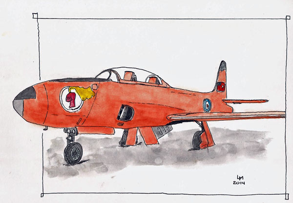
T-33 (Stillman & Birn Alpha 10×7, Pilot Falcon, DeAtramentis Black ink)

Michaud Service – A Limoilu Landmark

One of the fun things about sketching in Quebec City is being able to sketch buildings that have been repurposed and, sometimes, being able to see photos of what the building used to look like.  There are a couple photos of Michaud Service from the 50s but they’re copyrighted and so I’m not going to post them here.

Michaud Service used to be an auto service location, with two large bays and an office area, all accessible from the street side of the building.  There were also several bays whose doors faced north, on the other side of the building.  These days it seems that the north access bays are used for storage while the front of the building houses a couple social service organizations.  My sketch was done as I sat in a small park area on the south side of the building, an area that used to be a parking lot associated with Michaud Service.

In a way, this is a fairly plain building but the huge sign that still resides atop the building, and the somewhat organized graffiti along the south wall just spoke to me.  There was also the matter that I could sit in the sun which kept me from completely freezing as I sketched.  I did high-tail it for home and tea to do the color once I warmed up.

Michaud Service

Michaud Service: Stillman & Birn Alpha (10×7), Pilot/Namiki Falcon, Platinum Carbon Black


Book Review: The Urban Sketching Sketchbook: Architecture And Cityscapes

coverGabi Campanario’s long-awaited book, The Urban Sketching Sketchbook: Architecture and Cityscapes, as finally arrived.  Gabi is the guy who launched the urban sketching movement that is now a worldwide love affair and his first book, The Art of Urban Sketching, is still the best tour of the worldwide urban sketching community.

ruleofthirdsI’ve had this new book on pre-order for quite some time and I was thrilled when it showed up in my mailbox because it’s about drawing BUILDINGS.  Of all the things I draw, architecture is, by far, my favorite.  Architecture just says so much about a city and the people who live there.  And let’s face it, there’s a lot of architecture in an urban landscape.

centerpointIf you’re a sketcher you just have to smile when you look at this book.  Excepting the beautiful reproduction of Gabi sketches that grace both back and front covers, this book looks just like a sketchbook, complete with the elastic band that most of us very much appreciate on our sketchbooks.  I sure wish my favorites, the Stillman & Birn sketchbooks, had them.

patternsWhen you release the elastic you find a book that’s formatted similarly to his first book and features not only his sketches but those of many of the top urban sketchers on the planet.

The real meat and potatoes of this book is that Gabi takes on topics such as perspective, composition, drawing organization, simplification, and others while using architecture as the principle subject.  In spite of its small size (5×8 and 110 pages), it’s jam-packed with information for someone wanting to draw architecture.  This, in fact, is a gotta have book if you’re so inclined.  Highly recommended.