Rohrer & Klingner Waterproof Sketch Inks

When I started sketching, there were two reasonable candidates if you wanted to use heavily sized watercolor paper and wanted to use watercolor over your pen sketches.  You could use Platinum Carbon Black ink, a pigmented ink, and Noodler’s Lexington Gray, which relied upon bonding to cellulose for its water resistance.  Lex Gray was only passable because it was a gray and when it smeared it didn’t create really bad smears.  I used both of them – a lot.

When DeAtramentis Document inks came to market, the stampede could be heard worldwide as we all rushed to our ink store to buy these waterproof inks. They’ve made a lot of us very happy, though these inks are a bit on the pricey side ($20/35ml).

The story could end right there except that I’m like a bass in the weeds, lunging out at every shiny object trolled in front of my nose by the pen/ink manufacturers.  When the Jet Pens newsletter featured Rohrer & Klingner Sketch Inks, my credit card warmed up, some buttons were pushed and I had three bottles of ink winging their way to chez moi.

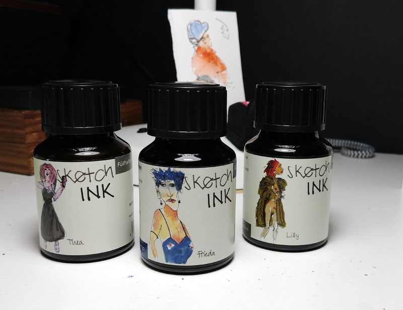
There are actually 10 different colors in this ink line.  Each ink carries a female name and the bottle features a sketch of a woman.  Maybe I’m supposed to know who these women are but I don’t.  What I do know is that they are INK SKETCHES of women.  Did I mention that the inks are called Sketch Inks?  How cool is that?

More important, these inks are nano-pigmented inks that are suitable for fountain pens and they’re a lot cheaper than the DeAtramentis inks I use.  For $12 you get 50ml which works out to 24 cents/ml vs 57 cents/ml for DeAtramentis inks.  And the sketches on the bottle are really nice.  Did I mention that the inks are called Sketch Inks?  Very cool.

I bought bottles of Frieda (dark blue), Lily (dull brown), and Thea (dark grey).  The dark grey is the most exciting to me because it’s a gray like Lexington Gray but absolutely waterproof even on Fabriano Artistico.   The dull brown is very close to a color I’ve mixed using DeAtramentis Document Brown with a bit of black thrown in to neutralize it a bit.

One thing that’s great about the colors I got, and I presume the rest of the line, is their matte quality.  One thing I’ve never liked about Platinum Carbon Black is the shiny line quality.  They should blend well with watercolor.  Also, at least on the Emilio Braga paper I used for a quick test (below) these inks dry fast, really fast. (ed note: just tested on Fabriano and the ink didn’t smear after 5 seconds, maybe less).

I haven’t had a lot of time with them (just arrived last night) but I stuffed Frieda into a Pilot Cavalier (fine), Lily into a Lamy Safari (Xfine) and Thea in to a Pilot Falcon (SFine).   I scribbled a bit on photocopy paper and went to bed.  Figuring I needed something to show you beyond a picture of the bottles, I stopped while I was out and drew a lamp post and trashcan.  I drew this same thing with each ink, spending a few seconds more than 5 minutes on this scribbly page.  I apologize for them being different sizes; I didn’t plan as well as I might have.  Ultimately, you’ll be seeing a lot of sketches from my use of these inks; particularly the grey and brown.  I think I love my new lady friends.

Left to right: Frieda, Lily, Thea, Emilio Braga 4×6 notebook.


The Scales Fall From My Eyes

I’ve watched Marc Taro Holmes smoosh color onto paper, shifting colors as he “built washes.”  I’ve heard Shari Blaukopf talk about creating mosaics of shifting colors on a surface.  And I’ve stared at hundreds of Liz Steel sketches (relevance later).  Apparently, I’ve got a pretty thick head because in spite of all this exposure to the concept, I didn’t get it.

No, it took a single comment in Liz Steel’s watercolour course (highly recommended) to get me to rethink watercolors.  I know little of watercolor use but the first thing shown in every watercolor book I’ve read is how to do a flat wash.  That’s how I’ve been applying watercolor…in flat, boring washes.  Apparently I learned that lesson well. But in a single statement, as Liz was discussing mixing on paper vs mixing on the palette, Liz said (paraphrasing), “I rarely use flat washes; I prefer adding texture in my washes.”  This simple statement somehow connected both of my neurons together and there was a flash of light, at least that’s how I remember it.

So, I started looking more closely and practicing the addition of variability into washes.  I still struggle with its application but I was pretty happy with this sketch.  It was an experiment to see if I could put a very textured, high contrast “wash” behind the focal point and sort of gradate both the texture and the color (lightening it) as I moved away from that focal point.  My table light was just an excuse for a background.

Stillman & Birn Alpha (5.5×8.5), Platinum 3776, DeAtramentis Document Black


Cute Things Come In Small Packages

There are parts of Quebec City that were originally built in the early 20th Century but that have since been modernized, mostly by putting modern facades on the buildings.  The result is really boring.  But if you wander around in said neighborhoods you find the odd house that has been spruced up a bit but that retains its older shape and aesthetic.

Claudette found just such a house and we went to sketch it.  It was a bit cool but sunny but on the upside, we had a great place to sit as we sketched.  It was a small, simple house and didn’t take long to sketch but when I got out my watercolors I managed to dump half a bottle of water in my lap.  Suddenly it got very cool and I looked as though I’d wet my pants.  Life of a sketcher.

Stillman & Birn Alpha (5.5×8.5), Platinum 3776, DeAtramentis Document Black

Back On St Vallier St.

We went back to St. Vallier with intent to sketch the Pignon Bleu, a building that I’ve always loved.  Only problem was that someone, some horrible someone, took a gorgeous building and “renovated” it into something they obviously thought to be an improvement.  Me, not so much.  Claudette and Yvan agreed so we ended up sketching a very unique building across the street.

My hand was not cooperating on this day.  Arthritis is an unpredictable thing but one thing is certain.  Having it in your drawing hand is frustrating.  Because of this I decided that I’d just draw the fancy balcony facade.  I still had some fun but I do wish you could buy replacement parts for old bodies.

Sketching Day In Levis, Quebec

Quebec City and Levis are separated from one another by the St. Lawrence River, which is a mighty river for sure, serving as the shipping highway between the Great Lakes and the Atlantic Ocean.  It seems to be a considerable barrier for our sketching group as we rarely go to Levis in spite of it being a great place to sketch.  I could leave this description just the way it is, fully justifying our avoidance of that city, but the truth is, it’s only a 10-minute ferry boat ride so we really have no excuse.

We did go last Saturday, though, thanks to an invitation by Marie Gauthier, who owns/runs an atelier in Levis.  And we had a great time, though I spent way too much time talking to the new acquaintances.  It was a cold day and I was underdressed so there was a bit of shivering going on as I drew this scene.  I guess it’s my Arizona roots but I’m always underdressed for the cold.