Memories From Old Toys

We’re still waiting for spring to come to Quebec City.  It’s quite unbelievable that it’s mid-May and the best we can hope for is a rainy, dreary day.  But until things warm up a bit (we had a frost warning last week) we’re sort of stuck going to indoor venues to draw.

We were provided with a new one, though, as the Quebec Historial Society opened a small exhibit of old, mostly tin toys from the 40s to the 60s.  As a kid, I was playing with those produced in the 50s so some were quite familiar to me and brought back memories.  I love tin toys, mostly for this nostalgia I suppose, but they were always so brightly painted to mask their simplistic nature.

I spent much of our session viewing the exhibit and reading all the description cards.  It’s not every day that you get to see and Easy-Bake Oven after all.  But eventually I sat down to draw and I did a poor job of sketching an old wind-up race car from the 40s.  I really need to slow down as the quality of my sketches is directly correlated with the speed in which I do them.

Stillman & Birn Beta (8×10 softcover), DeAtramentis Document Brn/Blk ink, Daniel Smith watercolors

Some Fun Museum Sketching

I was at our civilisation museum the other day and my joints were bothering me.  It was hard to draw and, even more, it was hard to concentrate because of the pain.  But I sat, stared at, and drew an Inuit stone carving of an Inuit stalking a seal.  I loved how a complete scene was captured in the rock.

Book Review: Shari Blaukopf’s Working With Color

If you’re a sketcher you know something about the Urban Sketching Handbook series.  These books look like a 6×9 Moleskine sketchbook, complete with the elastic band holding its covers together.  There were five of them.  Now there are six, the latest written by Shari Blaukopf and titled “Working with Color.

If you’re a sketcher who uses watercolors, you probably also know that it would be great if you could spend time talking with Shari and asking her questions about watercolor.  Most don’t get that opportunity, so she’s written Working with Color and  owning a copy is the next best thing (grin).

I binge-read my copy, which means it took me three days to get through it.  No, I don’t read that slowly but Shari’s book is written, as are the other Urban Sketching Handbooks, as a bunch of small sections full of guidance and tips.  It seemed that each one had me doodling and pushing paint around, trying out the things she talks about.  Not only did I have a ball, I learned a lot.

Like most books on watercolor, the early pages cover materials.  This book emphasizes materials that facilitate sketching on location.  I confess that I rarely get anything from such sections but it was interesting to see Shari’s palette choices.

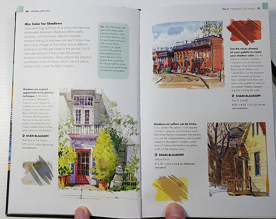
Very quickly, however, Shari moves on to color mixing and color and value in general.  Subjects covered include: mixing darks, mixing greens, shadow colors and a discussion of values.  Each of these subjects are supported by sketches that illustrate each subject.

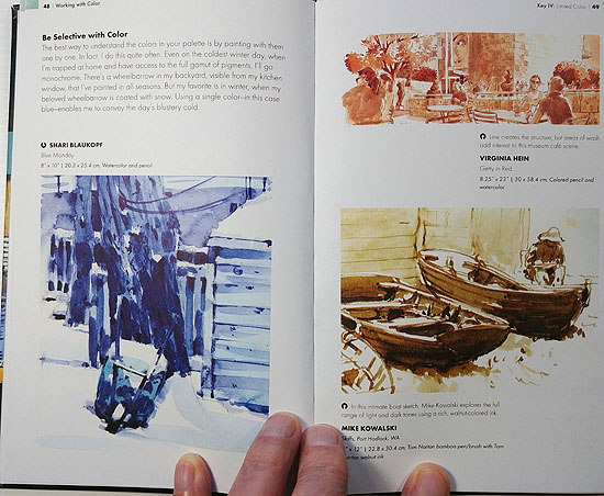
There is a section on limiting your color(s), from selectively choosing a single color to discussions of the use of a limited palette.  This later subject was time-consuming for me as Shari suggests several triads and, of course, I had to try them all (grin).

There are a couple different sections on using color to express mood and atmosphere and I have to read them again as there is much to think about in these sections.

There’s also a large section on mixing and using neutrals.  This is an area that is important to the watercolorist, but an area where I understand very little.  Mixed into this section is the notion of using warm and cool grays in an urban setting and it all seems like its the core of what I should know.  Wish I did.  This book is helping quite a bit.  I need to do a bunch more doodles and neutrals mixing though.

I do think that if you just read all the tips and look at the pictures, very little will change in your art.  This is stuff that you have to do if you’re going to begin to incorporate the ideas and methods into your art.  But heck, that’s the fun part and I can’t recommend Working with Color enough to anyone wanting to better understand how watercolors work and how they can be used in a sketching environment.


Sketching An Inukshuk

Inukshuks are common across northern Canada.  Seen principally as a product of the Inuits, other Native American groups also make them.  They are said to have been used as navigation markers, or markers of significant locations.  They commonly represent of Canada itself and some have deemed them a symbol of hope.  You can buy tiny inukshuks as souvenirs, sold right next to the beaver and moose figurines.

In any case their structure is meant to represent a human form and larger ones even have legs and arms.  Most have outward projections that represent arms in some way.  Mostly, though, they are a pile of rocks and I love drawing rocks.

We were at the museum the other day and in the Native American exhibit there is a small inukshuk that sits behind some large display cabinets.  You can see all of it if you’re standing in front of those display cabinets but I had to sit across the aisle from them so I would have light to see my paper.  This meant that I couldn’t see the bottom half of it.  I drew it anyway, direct with ink, and this is the result.

Stillman & Birn Nova (5.5x.8.5), J. Herbin Lie de Thé ink

I really had fun drawing this inukshuk and I remembered that I’d drawn one before, an inukshuk that resides on the Quebec Parliament grounds.  I decided to see if I could find that sketch.  I rarely look at my old sketches but  I did find it and I learned a couple things.  First is that this older sketch was done in 2012, only a few months after I decided to learn how to draw.  The second thing I learned is that I have actually improved as I’ve accumulated pen miles.  That made me happy.  Maybe inukshuks do represent hope.

100 People In Five Days

It’s BACK!!  Marc Taro Holmes and Liz Steel are, once again, leading the challenge to draw 100 people in five days.  I’m not a people sketcher but I did this last year and it was a lot of fun.  My advice is to set aside Monday and, draw, draw draw 30-40 people.  This makes the rest of the week easier as you’re less likely to fall behind and get stressed (grin).  Then, post your results with the tag #oneweek100people2019.

To demonstrate some ways of achieving the goal, here are some examples of how I drew 100 people.  None of these people captures took more than a minute or so (adding color not included) because these were real people, doing real things and they didn’t wait around for me to draw them (grin).

These were captured one at a time as they ordered coffee.

These floating heads were gleaned from TV.


These were people standing around in the mall.