De Atramentis Document Ink: Creating A Grey

The new De Atramentis Document inks (not to be confused with other De Atramentis inks) are a dream come true for those of us who sketch with fountain pens and want waterproof inks.  Before they came along, color choices could be described pretty much like Henry Ford described color selection for the Model T Ford – “any color as long as it’s black.”

The current elephant in the room question is whether we’re going to have a ready supply of these inks over time.  De Atramentis is a one-man operation and Goulet Pens, to my knowledge, is the only source for them in North America. Their last shipment came in and went out before some people had a chance to even see them show up.  Brian has said their current order is very large.  I hope so.

I was one of the lucky ones.  I’ve had De Atramentis Document Black and Brown for a while now and was able to fill in the other colors during the few hours they were available at Goulet Pens.

The potential to create any color I want now exists, except for one thing.  De Atramentis sells a solvent for their inks and proper dilution should be done with that solvent.  These inks are pigmented inks and every ink have a particular chemistry to give them the flow and paper interaction properties of a particular brand of ink.   The proper solvent should be used to provide the proper lubricant, stabilizer, and maybe anti-fungal agent in their proper proportions.  The big deal here is the lubricant as this generates proper flow through the pen.  Too much lubrication and you can get feathering, nib creap, and slow-to-dry inks.  Too little and you can get a dry-writing ink, though it may actually dry more quickly.

So before I continue, there’s my caveat.  If you fear doing anything that might be referred to as an “experiment”, read no further.  This is an experiment.  I’ve mixed up a grey ink using the brown and blue ink in this line.  It creates a very dark grey, not unlike Noodler’s Lexington Gray  but a bit darker.  I wanted to lighten it up, but the solvent isn’t available to me, so I used water.  Worse still, throwing caution to the wind, I used plain old tap water to thin the ink.  Here’s what I mixed:

De Atramentis Document inks, not to be confused with other De Atramentis inks:

Brown:  3 parts
Black:    2 parts
water:    3 parts

That works out to 60% water, which is a lot but I found that when thinning other inks I had to add a considerable amount of water to lighten their color.  This proved true for the De Atramentis Document inks as well, maybe even to a greater degree.

grey

grey2
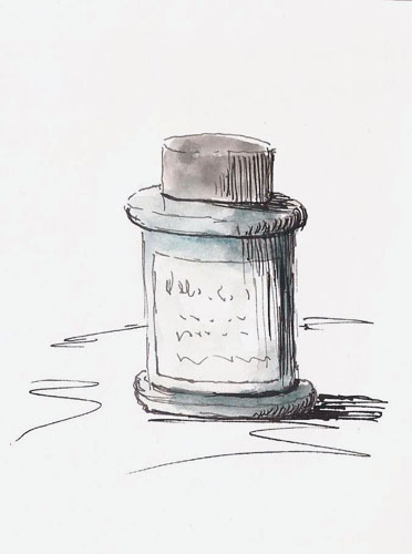
As you can see, I got a decent dark grey.   I may want to play a bit with the blue/brown mix or maybe try a green/red mix but this is just about what I want on a tonal scale.  Just enough to take the harsh black edge off my sketches.

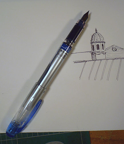
The real point of the experiment, though, was to see how diluting with water would work.  I’m surprised to say that even with this extreme dilution, the ink holds up nicely.  There is no feathering, the line remains consistent and there are no flow problems with the Pilot Prera (fine nib) that I used to dispense it.  I wanted the sketch to reflect the tonal differences between the black and gray lines so I used De Atramentis Black to do all the shadow lines on the right side of the bottle.  After scanning I quickly slopped watercolor all over it and can report that the waterproof nature of the ink is retained.  All of this is being done on cheap sketchbook paper.  Just to ensure that it wasn’t the result of the paper, I did a bunch of scribbles on Stillman & Birn Alpha series paper and those were were waterproof as well.

By the way, there’s been some discussion of a Fog Gray color being added to the De Atramentis line.  Those few who have had access to it have found that it’s really more of a grey blue than a true grey.   Given that it’s easy to mix our own greys, though, it hardly matters.

For me, the experiment was a great success.  To be honest I’m still a bit surprised because in my experience, dilution of pigment-based products (wood stains I’ve used) with water are very limited and things tend to fall apart once you get past 10-15%.  Here I’ve more than doubled the volume of ink with water..and it still works.  Go figure.  I still wish I could get access to De Atramentis solvent but until that time…I’m going to go draw a few shades of grey.

Sketching Rendevous At The Musee de la Civilisation

I’m a member of the Collective des ateliers libres en arts visuels de Québec.  And yes, the name’s too long but they do a great job of organizing life drawing workshops throughout the winter months.  I’m not very interested in drawing people but this group causes me to wish I were.  In the summer there is a great weekly event where we gather in a local park and draw people, mostly portraits.  They’ve also started to organize outdoor, group events with other sketching targets.

2015-01-24masks

These stage masks are part of a very large raised-relief sculpture that is part of the Olympus exhibit. The holes for the eyes and mouth look sort of odd in this context but it is what it is.


So it was last weekend when we all gathered at the Musee de la Civilisation to sketch the Olympus exhibit.  It was a great day as it’s always fun to get together with people who like to do the things you do.  We sketched all morning, broke for lunch and sketching talk, and then some of us returned to sketch some more.

Kerry_OpenI worked in pencil the whole day and I’d forgotten my pencil case so I was using a Pentel Kerry (0.5mm) in my Stillman & Birn Alpha (10×7) sketchbook.  I love this pencil.  It’s pretty spendy but being able to put a cap on the pencil end (the entire red portion on the rear is the cap) is really nice for street sketching.  I do wish I’d bought the 0.7mm though.

Truthfully, while I love the Alpha series for my pen sketching, it’s got more tooth than I like for pencil.  I prefer their Epsilon series for pencil, though I’m not much of a pencil driver regardless of paper.  But I had a lot of fun and the museum was warm, unlike my normal stomping grounds of Quebec streets.

2015-01-24statue

You can’t have Greek Gods without snakes.


Writing At The Coffee Shop

It’s been so cold here lately that I’ve been reluctant to go walking.  The other problem, of course, is that ‘walking’ is more like slipping and sliding here right now.  So I’ve been doing some writing, trying to make some progress on that front.

2015-01-21brulerieBut I can only stay at home so long before I start going nuts so I went to a nearby coffee shop to work.  I grabbed a table in the back corner of the place and a café allongé and went to work.  After a couple hours I took a break from editing and decided to give my new Sailor calligraphy pen a test run.  I quickly sketched (3×5) the view I had, which wasn’t great because I purposefully had hid myself from most of the clientele.  This pen is quite different from my Hero calligraphy pens and Tina Royama claims it’s easier to control.  I think she’s right but it will take a bit of getting used to, as this sketch illustrates.

2015-01-20crossingguard

I got another coffee and moved to a place by the window and worked for another hour. I saw this woman working as a crossing guard in the bitter cold.  The sad look on her face got my attention and I devoted a bit of ink to capturing her plight.  I shared those feelings as I’m an Arizona boy and Quebec winters are not something I take to with great fondness.

I looked around and there was a guy sitting with his back to me.  He was wearing a backwards baseball cap.  He’d taken his coat off and was wearing a t-shirt.  For some crazy reason this stuck me as odd, given that everyone else was wearing long sleeves, sweaters or coats.  Internally I chuckled and I drew him as though it weren’t -30 outside.  I drew him in his t-shirt, backwards baseball cap and shorts.  I guess I was hoping it would make me feel warmer.

2015-01-21guy

This sketching adventure involved about three hours of writing/editing and less than ten minutes sketching but it was better than nothing (grin).


Pen Review: Platinum Preppy 02

open

I’ve always been a fan of the Platinum Preppy.  There is no better bang for the buck ratio in the fountain pen world in my opinion.  For a street price of $3-4 you get a fully-functional, cartridge-fed fountain pen that can even be upgraded with a converter if you so desire.  It comes in half a dozen colors and each comes with a matching Platinum ink cartridge.

One of the ironies of life is that this inexpensive pen is one of the most reliable pens I own, and I own a lot of pens.  Until now, they’ve come in 05 and 03 nib sizes and I’ve always favored the later because I tend to work small and thus love fine-nib pens.

nibSo, when Platinum released an 02 version of this pen I had to try one.  It arrived as part of an order from Jet Pens with one little glitch.  Platinum’s cartridges are nice as they use a small metal ball to seal the end.  When you insert the cartridge, the ball is shoved into the cartridge and acts as an agitator for the ink, one of the things that makes these pens so reliable.

But guess what happens if you put water-based inks in a -30C environment which was my mailbox.  Yep…the ink freezes, expands, and the little ball is shoved out the end.  Fortunately, it was washable ink and so an easy clean up.  So, my tests with this pen were done with J. Herbin Perle Noire ink rather than with the Platinum blue that comes with it.

closed

The appropriate review word for this pen is WOW.  If you like fine pens you will like this new Preppy 02.  If you don’t, you won’t.  It is just a bit finer than a Micron 01.  Like other Preppy pens it is smooth for such a fine nib and I spent half an hour just making hatch marks and little doodles with it.

This pen has a fancier paint job than do the 03 and 05 versions.  I’m not sure if this is a remake of the Preppy line and/or if we’ll see this scheme on the rest of the Preppies soon.  It is the case that the 02 is more expensive than the 03 and 05, at least right now.  Jet Pens currently sells it for a whopping $4.45, or the cost of a decent sized latte at Starbucks (grin).

quicksketch

Frustrated January Sketcher And Other Stuff

I apologize for not posting much since Christmas.  I’m full of excuses if that will help.  You see, while most folks get to return to normal after January 1st, my holiday season is in full swing.  My daughter was home for the holidays.  Both Chantal and Jodie have birthdays in the first half of January and we just returned from Ottawa.  Oh…and it’s VERY cold, so for a street sketcher it’s a tough time of year.

I looked at my total sketching experiences from my Ottawa trip and two things happened.  First, I sighed and did a mental ‘woe is me.’  Then it occurred to me that it might be worth mentioning a couple things about the result, so here it is.

2015-11-OttawaClearly this isn’t a post about my great art.  Rather, I want to talk about some philosophical and pragmatic things that these two pages represent.  You see, this is a brand-spanking new Moleskine sketchbook.  Now I’m not a fan of these sketchbooks for ‘real’ drawing but I had the opportunity to get one cheap and so it’s going to serve as my daily ‘quick-sketchbook.’  I carry one of these with me at all times and not stuffed away in my man-bag (which holds my regular art stuff) but rather in my pocket, with some sort of quick-sketching pointy device tucked away with it.  It can be brought out in seconds and is often returned a couple minutes later with a new sketch between its covers.  I started doing this about two years ago when my buddy Yvan Breton convinced me of the power of such an approach.

Two things occurred when I started carrying such a sketchbook.  The first, and most important was that I started doing a LOT more sketching.  In the past couple years I’ve filled about 20 of these little 3×5 or 4×6 sketchbooks in addition to my regular sketchbooks.  Most of the pages are filled with quick sketches, though sometimes I’ll do something more complete.  No matter how you slice it, that means a lot more sketching fun and sketching practice and I can do it when no other kind of sketching is possible.  The other thing that has happened is that my ability to see shapes quickly has improved immensely and it allows me to be more loose with my line work than is my typical style.

The sketch on the right is typical.  I was sitting in a restaurant with my family and we were waiting for our food to arrive.  This woman was standing at a bus stop across the street.  I took out my sketchbook and pen, a Uniball Vision, and quickly sketched her.  I doubt that it took two minutes, which included having to wait for a large truck that blocked my view as it waited for a light.  Then the book went back in my pocket and I was ‘back’ with my family.

The left page is also interesting as it shows my lack of respect for the space so many treat as hallowed ground – the pages of a sketchbook.  When you worry about whether every page is worthy of posting on Facebook, you will lose many opportunities.  My small sketchbook is a place where ‘who cares’ rules.

In this case I’d started a sketch while leaning against the wall of my daughter’s apartment.  I was looking out the back window and had started drawing a nearby building.  I was using a Zebra 301A ballpoint.  It was announced by my boss…err..wife, that it was time to go so the book went into my pocket.  We were headed for Ikea.

We hadn’t been in an Ikea in a decade and acted like farmers in a big city for the first time.  We ate meatballs and wanted to buy everything in sight.  Realizing that we had to write numbers of stuff we might want to buy, I pulled out my Moleskine Sketchbook and started writing.  Would you do that with your sketchbook?  It’s to your advantage to be willing to do so as otherwise you won’t start a lot of sketches because you won’t feel you have time to ‘finish’ or ‘do the sketch justice.’  We did buy that kitchen island, by the way, and hauled it back to Quebec.

Now, do you need a Moleskine sketchbook for this?  Heck no, and in fact I’d advise against it.  The paper is ok for pen or pencil but it stinks for watercolor isn’t necessary for pen, and they’re ridiculously expensive.   Most of my small sketchbooks are 3×5 or 4×6 sketchbooks that I’ve bought at our dollar store, though they typically cost me $2.