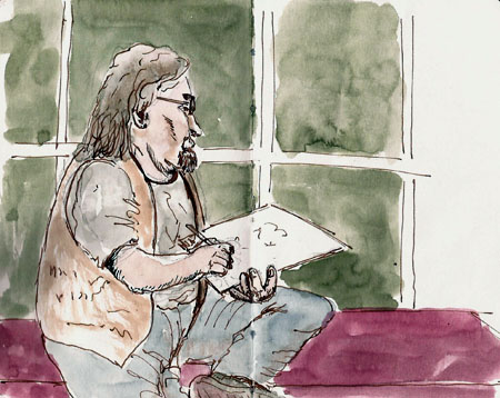
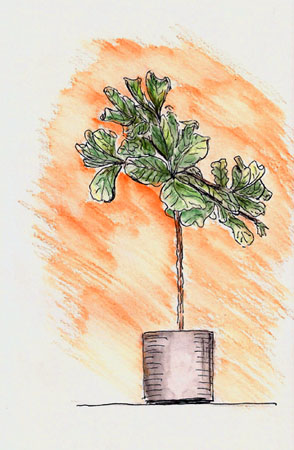
When I got into sketching, about four years ago, I found it pretty easy to find quality pens, pencils, brushes and watercolors. What was harder was to find a sketchbook that could accommodate pen, ink and watercolor. It seemed that I was buying a new sketchbook every week in an attempt to ‘try another’ in my quest for the perfect sketchbook.
My first post about Stillman & Birn sketchbooks was in December of 2011. A few other artists had discovered them and were really excited by them. I’d just gotten one and was very new to sketching so it was hard for me to evaluate it except to say that I liked it.
My first real discussion of S&B came in March of 2013, after I’d had some time to fall in love with their products. At that point I’d done a lot of sketching on their Alpha series paper and had just bought one of the Epsilon series sketchbooks. If you read that post you’ll get the impression that I worked as a sales rep for S&B but I do not.
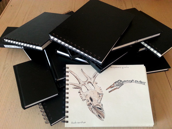
In the future my daughter is going to be faced with the task of taking my sketchbooks to the landfill. When she does, I suspect my pile of Stillman & Birn sketchbooks will be even larger. These are the ones I’ve filled in the past 3 years. Several others are ‘in progress’.
Since then I’ve been filling S&B sketchbooks at an alarming rate. I’ve tried not only Alpha and Epsilon papers but also their Beta, Zeta and Gamma sketchbooks. You can find reviews of these sketchbooks if you search for those words here. I have a lot of experience with Stillman & Birn products, and I can’t imagine using anything else.
But there’s been one sketchbook format that S&B hadn’t provided me, until now. I’ve whined to them about it enough that you’d think they would have made some just to shut me up. It’s a small (3×5) portrait format book that has paper good enough (interpretation = Alpha paper) to accept my scribbles and watercolor smears. Because this has not been forthcoming from S&B, I’ve been making do with crappy books from the dollar store, Field Notes, small (?) Visual Journals, Moleskines, etc. At this point I’ve filled 27 of the darned things. You’d think I’d know how to draw by now with all that scribbling. Maybe in another 20 years.
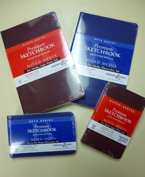
Anyways, Stillman & Birn has just released the solution to my small sketchbook needs, and then some. The photo above shows just a few of the many format/paper combinations available in this new series. All of the S&B’s paper types are available and each has its cover color-coded for that paper type (Alpha = burnt sienna (red?), Beta = blue, Epsilon = gray, Delta = green, Gamma = brown, Zeta = black). They’re available as 3.5×5.5 and 5.5×8.5 portrait or landscape format and in 8×10 portrait format.
I like the cover material. It feels almost like leather, though it is obviously not. It’s stiffer than the Strathmore softcover books, a plus for a street sketcher like me. The papers are the same great papers you can find in their hardcover books so I’m not going to talk about them. You can find my opinions by searching for the reviews on this blog but so far I haven’t found any that I don’t like. I use Alpha and Beta almost exclusively though.
Stillman and Birn have obviously tried to provide lighter and thinner sketchbooks compared to their hardcover books and in that they have succeeded in a big way. Here are a few comparison numbers:
Hardcover Softcover
Alpha 5×8 419gm 232gm
Beta 5×8 354gm 267gm
The thickness of a 5×8 Alpha hardcover is 18mm while the Alpha softcover is a svelte 10mm. In short, these new books are much lighter and thinner than their hardcover counterparts.
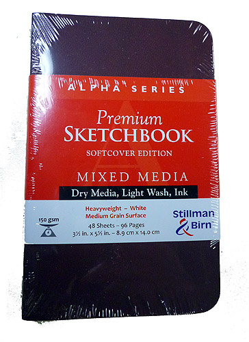
Here is my favorite. I’m showing it before I took the shrinkwrap off because now that I’ve opened it there is some drool on the front cover. It’s a small, Alpha-series portrait-format book. Many who use the Moleskine watercolor books have complained that Moleskine doesn’t produce it in a portrait format. I used to be one of them, but no more. I now have my small sketchbook need satiated, or at least it will be when I place an order for a bunch more of these little guys.
Do you need/want the softcover versions of Stillman & Birn sketchbooks? It depends. It depends upon whether weight matters to you. If you carry a single sketchbook and not very far, then giving up those nice hardcover bindings might not make sense. I carry several sketchbooks and regularly carry them during two-hour walks so cutting the weight nearly in half is a big deal for me.
Are you ever bothered by the thickness of your sketchbook, say when you’re trying to draw along the edge where you have no support for your hand? Do you wish the book were thinner when trying to draw across the gutter during early or late sections of the book, where one page is bent downward to reach the table due to the thickness of the book? If these things bother you, maybe having a book that’s half as thick would make you happy. Beware, though, this comes at a cost. While the covers reduce the thickness, the softcovers are also made thinner by a reduction of page count (in Alpha the hardcovers have 62 sheets while the softcovers have 48). I find this a small price to pay to get what I want in the small-size book.
There is one downside to these softcover books. They use the same double-stitched, glued bindings of their hardcover counterparts and the glue sometimes wicks between the signatures (the small groups of sheets that are folded and sewn together) and they tend to stick the base of the two pages between two signatures together. I don’t find this to be a problem with Alpha, and probably not with the other 150gsm paper books. Their pages fold open just fine. But with the Beta (270gsm) and probably Delta and Zeta books, the paper tends to separate slightly at the gutter when you fold open a section where two signatures come together (6 places in a Beta series book). This separation is very tight in the gutter of the two-page spread and if you’re working on either side of the gutter, it’s not a problem at all. But if you want to do a two-page spread, it can create an ugly gutter seam.
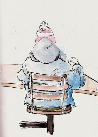
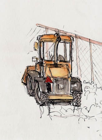
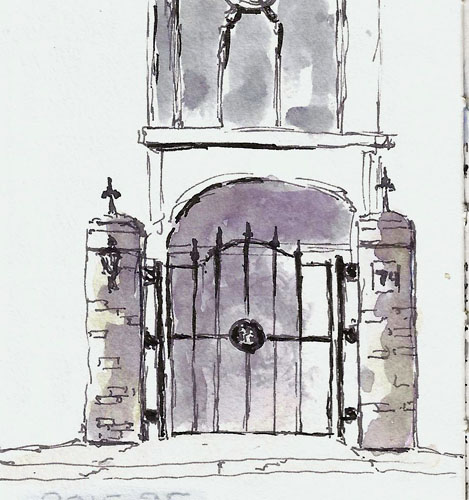
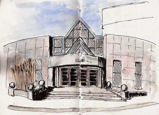
I’m thrilled with these new softcovers. I’ve only drawn a couple things in them thus far but I know the papers well and have documented their use in pretty much all the drawings presented on this blog. The softcovers, like Stillman & Birn’s hardcover and spiral-bound books, are great options for the urban sketcher or nature journalist. I feel lucky to live in a time when we sketchers have so many great choices, and all from one company – Stillman & Birn.