Sketching The Past

Winter sketching, as I’m mentioned before, is confined my sketching to indoor venues.  That’s ok because there are museums, coffee shops, and librarys to provide sketching opportunities.  But what’s a guy supposed to do when he’s sitting at home and wants to draw?

Photos?  I’m not very good at drawing from photos as I don’t feel I can ‘see’ the same as when I’m actually on location.  It’s also not as much fun for me.  But that’s the choice that Mother Nature gives me so what the heck…photos it is.

What photos, though?  I’ve taken a lot of photos of Quebec City with the thought of using them as sketching material but it’s occurred to me that there may be better alternatives.  Why not sketch stuff I can’t see any more?  Dirigibles, Victorian hats, inkwells, carrier pigeons or steamships?  Or trains….that’s it…trains.

Our society decided we’d subsidize the trucking industry in the 50s and 60s by building a highway system which allowed that industry to outcompete the railroads, that had to maintain their own ‘roads.’   So, now we’ve got LOTS of trucks to draw, lots of trucks burning fuel, and the warehouses of our world have become 18-wheel diesel-powered boxes clogging up our highways.  Oh and we have far fewer trains.  So yeah, I could draw trains.

And what better place to start than with the lowly caboose.  As a kid, train watching was a big deal.  We’d wave at the engineer as the engine went by, hoping he’d blow the whistle for us.  Then we’d wait…and wait and finally, after a bunch of boxcars, tankcars, and hopper cars, here it would come…the CABOOSE…the crummy, the brain box, the dog house…whatever you called it – it was RED!  They were mostly eliminated from trains in the 1980s, replaced by “EOTs” (End Of Train device) which are boring boxes of electronics and a red light that get hung on the end of the train.  Kids don’t watch trains any more and I don’t blame them.  My daughter didn’t even know what a caboose was when I showed her my sketch.

Stillman & Birn Alpha (9x6) sketchbook, Pilot Prera, Lex Gray ink.

Stillman & Birn Alpha (9×6) sketchbook, Pilot Prera, Lex Gray ink.

I sketched this one from a black and white photo in a book I own.  It was fun.  My daughter learned what a caboose was.  Maybe I’ll draw some other things she has never seen.

Art Deco Period Houses in Quebec City

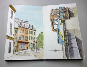
One of the things I love about Quebec City is that there is an obvious location of the founding period of the city.  Our “old city” is a UNESCO Heritage site, as it is the oldest walled city in North America, officially founded in 1608.  The history is rich and evident.

And as Quebec City grew, people moved beyond the walls and the city spread outward as lava flows from a volcano.  This outward movement was limited by the St. Lawrence River to western and northwestern expansion.  The result of this slow expansion is a “map” of how architectural trends changed over the years from 1600 to the present and, as a sketcher, it can be examined much as an archeologist examines layers of rock.

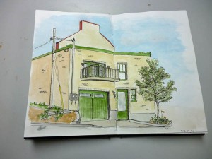
I’ve spent most of my time sketching inside the old city, as the architecture there is both early and a combination of French and British influences.  But, if one wanders away from the walls of old Quebec by just a few kilometers, one hits the motherlode of Art Deco architecture.  Bay windows and corner towers give way to rounded walls, flat roofs, and frosted glass decorations – a completely different world from the French architecture of our Chateau Frontenac, the architectural symbol of Quebec City.

Here’s my first art deco house sketch but it won’t be my last.  I love the cobblestone-like rounded wall and the door.  I’m looking forward to mining the art deco layer of our architectural history.  Sketching in Quebec City is exciting and fun.

Stillman & Birn Alpha (9x6 landscape) sketchbook, Pilot Prera, Platinum Carbon Black ink

Stillman & Birn Alpha (9×6 landscape) sketchbook, Pilot Prera, Platinum Carbon Black ink

Fall Is Here; Just Say No To Snow!

Fall officially came to Quebec a couple weeks ago.  Many of the trees, and certainly Mr Weathermaker, didn’t get the memo.  We’ve had very warm temperatures for a last couple weeks and the trees are very confused as daylength tells them to drop their leaves but the temps are saying “not yet.”

But, slowly and as surely as politicians will screw things up, winter is approaching.  For me, a street sketcher, it’s a time of transition.  It’s a time when I start figuring out what/where I’m going to sketch once it gets too cold outside to do what I love – sketch on the streets.

To that end I’m thinking about museums, have convinced myself that I should try, again, to sketch from photos, and that I should use Google Maps “pegman” to sketch in exotic places while snow blankets my world.  We’ll see.

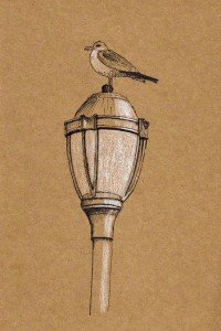
toned paper; Pilot Prera and Prismacolor white pencil

toned paper; Pilot Prera and Prismacolor white pencil

In the meantime I’ve been doing some sketching.  I received a handmade tan-paper sketchbook from my buddy Pat Ng in Singapore and did this sketch to sort of break it in.  The gulls love to sit on the lamp posts around here so I had plenty of source material for this sketch.

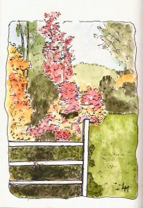
This sketch was done in celebration of the show the trees put on for us every year.  Fairly simple, I combined a Uniball UM-120 black pen (.5) with a Uniball UM-151 brown-black (.38) pen and did it in a Stillman & Birn Alpha (4×6) sketchbook.  The fence lets me call it an ‘urban sketch’ 🙂

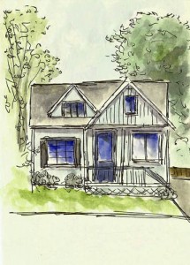
2013-10-07Fall2013-10-07QuickHouseI spent Monday night looking at a bunch of sketches done by Liz Steel, a very talented architect/sketcher.  She talks about how she works very quickly and why.  The next day I was walking down a street and saw this little house.  I decided to try out Liz’s philosophy/approach and while I didn’t produce anything near the quality of her sketches, once I buried the ‘ooooo…that’s not right’ and ‘oops…left that out’ I found the results interesting and I’ll probably do some more like this.  Took less than 10 minutes, including the time to get out my watercolor kit and waterbrush.  It was done in my ‘el cheapo’ 3×5 notebook and my Uniball UM-120 (.5) pen.

Sketching, no matter how it’s done, is fun and after two years of doing it, I can’t imagine a day without it in my life.


Stillman & Birn Zeta: A Pen Sketcher’s Dream

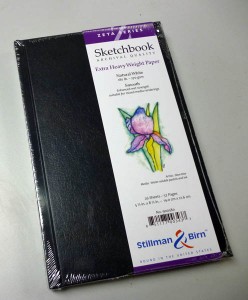
S&B_ZetaBack in November of 2011 I bought my first Stillman & Birn sketchbook.  It was a 5×8, hardcover Alpha-series book.  I wrote about the Alpha Series here.   In that blog post I said that I liked it very much and I gave several reasons why I felt it outperformed the other sketchbooks I’d tried. I also ran out and bought several more.  But as I’d only had it for a short time I added the caveat that “It’s probably premature to draw conclusions that will stick.”

Well, nearly two years and ten S&B sketchbooks in use or filled, I think I can be a bit more definitive…but with another caveat.  Stillman & Birn just keeps getting better and better so who knows what ‘best’ will look like in the future.

I find the colors are brighter on Zeta paper, probably because they aren't absorbed into the paper as much.  Makes lifting easier as well.

I find the colors are brighter on Zeta paper, probably because they aren’t absorbed into the paper as much. Makes lifting easier as well.

As I filled sketchbooks, I tried the other Stillman & Birn papers.  For the pen & ink work I do, the Epsilon sketchbooks are wonderful to draw on.  It took me a while to get used to how the smoother paper accepts watercolor as they stay wet longer and sit on the surface more, which is neither good or bad but different from the more absorbent Alpha.  The best equivalency I know is to the differences between cold-press and hot-press watercolor papers. Both of these papers are 100lb papers that, while they outperform any papers of this weight I’ve ever used, they still have a tendency to curl somewhat when lots of water are applied.  You can see a bit of shadowing if you use both sides of the paper.

And then I tried Beta, S&B’s 180lb paper.  This is surfaced very much like a cold-press paper and provides a fantastic surface for watercolors but not as nice as Epsilon for pen use.   By the end of the summer of 2012 I wrote a summary post on these different sketchbooks.  I was completely hooked on Stillman & Birn papers and their amazing double-stitched bindings which are second to none.  But at the time I thought “They need thick “Epsilon” paper.

Notice how flat S&B sketchbooks lay once they've been broken in.

Notice how flat S&B Zeta sketchbooks lay once they’ve been broken in.

And this is the thing about Stillman & Birn.  If you dream it, they magically know you were dreaming and they make it.  The Zeta sketchbooks were release a few months ago in response to my dream.  I’m betting others were dreaming the same thing.

I use several S&B sketchbooks (different sizes and papers) simultaneously and when the Zeta series was released, I immediately started using one.  It quickly became a favorite for my kind of sketching (pen/ink and wash).  It’s a merging of best of Beta and Epsilon into one paper as it’s 180lb Epsilon paper.  I’m working in my second Zeta sketchbook and it’s hard for me to see any reason to use any other, if the size I want is available with this paper.

There lies the rub as I still use Alpha in 4×6 and 10×7 formats.  I will likely buy a 7×10 spiral bound Zeta as a substitute for my 10×7 Alphas but, so far, S&B haven’t produced a truly small sketchbook (thin, 3×5) – my current dream.  I hope that when they do it will contain Zeta paper (grin).

A Red Flag Will Stop A Sketcher Every Time

As an urban sketcher, with a penchant for the mundane, I couldn’t pass up this scene. The railroad track in the background feeds into the train station here in Quebec City. A passenger train was headed inbound. The track in the foreground is a seldom-used track that allows a connection between a huge cargo facility on one side of a river and another one on the other side. Not much traffic but they’re not interested in any at all when the passenger trains come and go (only a few times a day).

2013-07-08RRflag

And so, they clip this flag to the track, to let anyone thinking of taking their train engine for a spin, not to do it. The bright red flag created an interesting scene, at least to me. Done in my Stillman & Birn Alpha (10×7) with a Pilot Prera, PCB ink, W&N artist watercolors and limited skill.